


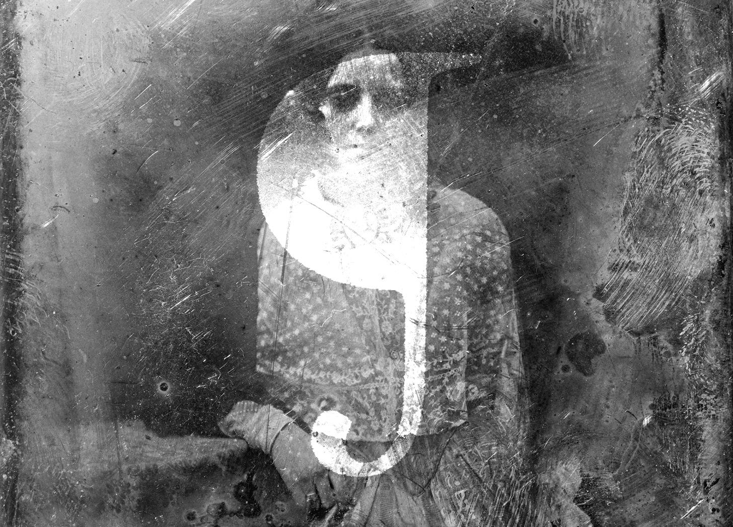
The Indented Paragraph is a Haunted House
And its ghost is called the pilcrow.

I don’t know if this is comforting or tragic, but apparently, even medieval monks had deadlines. It is to these deadlines—and their being missed—that we owe the existence of that empty space at the beginning of printed paragraphs.1
The indented paragraph is a haunted house, and its ghost is called the pilcrow.
To put this in the simplest of terms, the pilcrow (¶ ) is a symbol that used to denote a new paragraph—and still does, if you’re familiar with copyediting marks and your word processor’s hidden characters.
¶ The symbol has a long, interesting history that I can, for lack of space, only touch on here. “The pilcrow,” Keith Houston writes in Shady Characters: The Secret Life of Punctuation, Symbols & Other Typographical Marks,2 “is not a mere typographic curiosity, useful only for livening up a coffee-table book on graphic design or pointing the way to a paragraph in a mortgage deed, but a living character with its roots in the earliest days of punctuation.”
¶ Despite an emphasis on reading aloud from the Greeks and Romans, the paragraphos3 first appeared around the fourth century BC and “took the form of a horizontal line or angle in the margin to the left of the main text,” Houston writes. The mark’s exact meaning would change in each context and according to each author, but it most often marked a change in topic or structure.
¶ A few centuries later, writing gained other markers of pause in text. “When reading a contemporary manuscript,” Houston writes, “a literate Greek of Homer’s time would be faced with an UNBROKENSTREAMOFLETTERS, all uppercase (because at that time there was no other case), with lines running alternately left-to-right and then right-to-left across the page.” Eventually, Aristophanes of Byzantium, the librarian of Alexandria, introduced a system of dots to indicate pauses according to the rules of classical rhetoric. It took centuries, Houston says, but these marks would become the familiar comma, colon, and period. But unlike modern punctuation, “Aristophanes’s dots were intended solely as aids for reading aloud.” Despite their survival to modern day, these dots were only used “fitfully” and had to “contend with the Romans disdain for punctuation in general.”

¶ The paragraphos soldiered on in a growing variety of forms … while some others dispensed with the mark altogether and instead outdented or enlarged the first few letters of each paragraph to yield litterae notabiliores—literally, “notable letters.” Still others inserted the letter K for kaput, or “head,” to mark the “head” of a new argument or thesis, and it was this particular convention that would give rise to the pilcrow.

¶ Kaput’s journey to becoming a pilcrow required many centuries, the advent of Christianity, and finally, our monks. If you are interested a (much) less abridged version of this history, I recommend you check out Shady Characters.
¶ Though it lasted for several centuries beyond the Etruscan K in writing, K for kaput was eventually usurped by C for capitulum, or “little head,” by the twelfth century. “Many of the religious documents that formed the bulk of Western civilization’s written works were studded with C’s dividing them neatly into capitula, or ‘chapters,’” Houston writes.

¶ It was at this time that Christian monks were copying religious texts by hand. They did so in a production-line fashion, leaving each task to a specialist. The capitulum was left to the so-called “rubricators” (from the Latin rubrico, “to color red”), who not only added decorative flourish but also drew the reader’s eye to important divisions in the text.
¶ In the hands of the rubricators, C for capitulum was soon accessorized by a vertical bar, as were other litterae notabiliores in the fashion of the time; later, the resultant bowl was filled in and so ¢ for capitulum became the familiar reversed-P of the pilcrow.
¶ The appearance, and its usage, would change, but in essence, the pilcrow was now used to denote a new paragraph. By the mid-1440s, the symbol and its meaning had been ensconced into writing itself. “Having attained such singular importance, the pilcrow then did something remarkable,” says Houston. “It committed typographical suicide.”
¶ As mentioned, the drawing of these pilcrows and other decorative devices during the time of illuminated manuscripts was left to the rubricators. The scribe would leave a blank space to be filled in later. This practice would continue into the era of movable type and Johannes Gutenberg’s printing press, with the marks growing “ever more elaborate and time-consuming to add.” As the sheer volume of printed documents grew, it became impossible to keep up. Time ran out, and deadlines were missed.
¶ “The rubricated pilcrow became a ghost: its brief reign as the de facto paragraph mark was over, usurped by the indented paragraph.”
¶ So there you have it; we indent paragraphs due to missed deadlines and unnecessary complexity—isn’t that the most human thing you’ve ever heard?
¶ If you enjoyed this, I recommend Shady Characters. You can also read more from Keith Houston himself—about the pilcrow other marks—at his website, shadycharacters.co.uk. You can read about the ampersand, the interrobang, the @ symbol, and more.

News
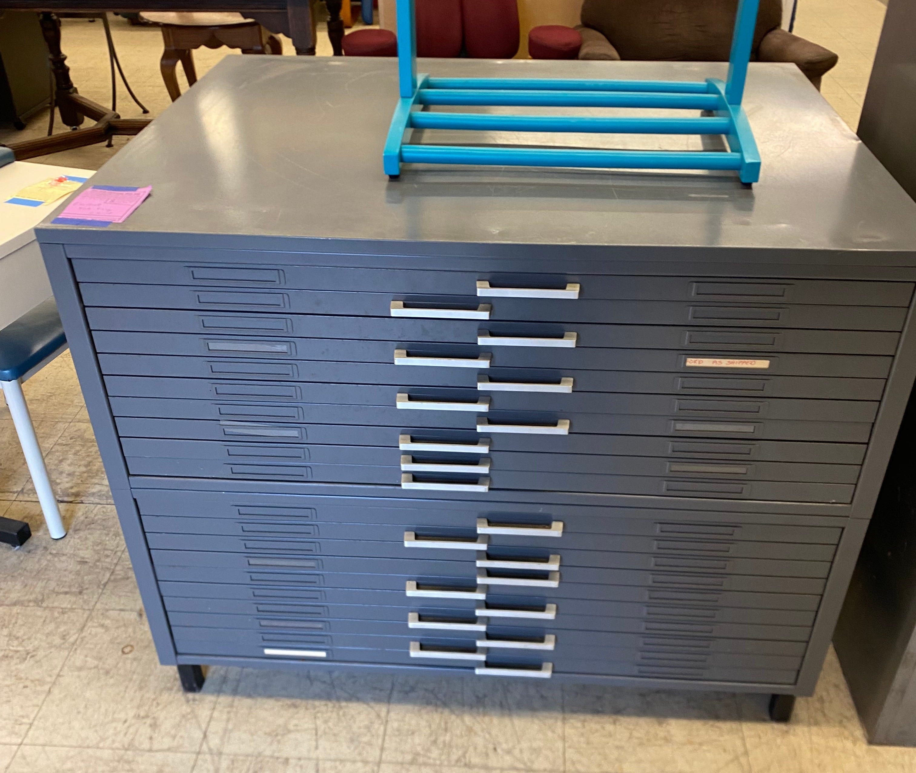
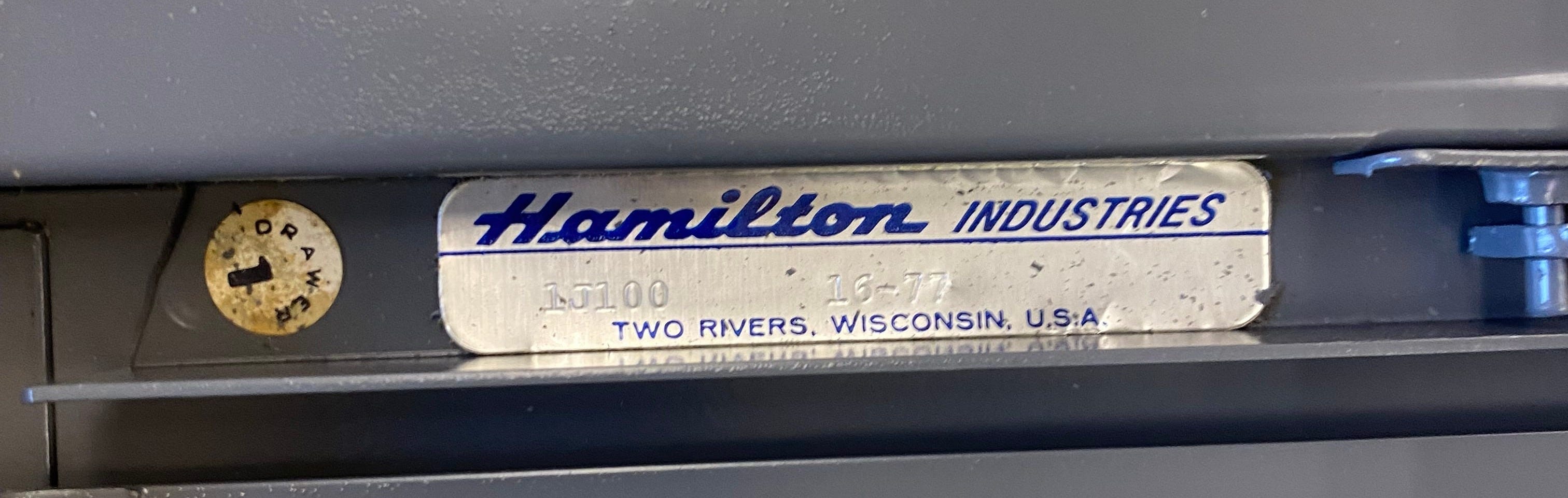
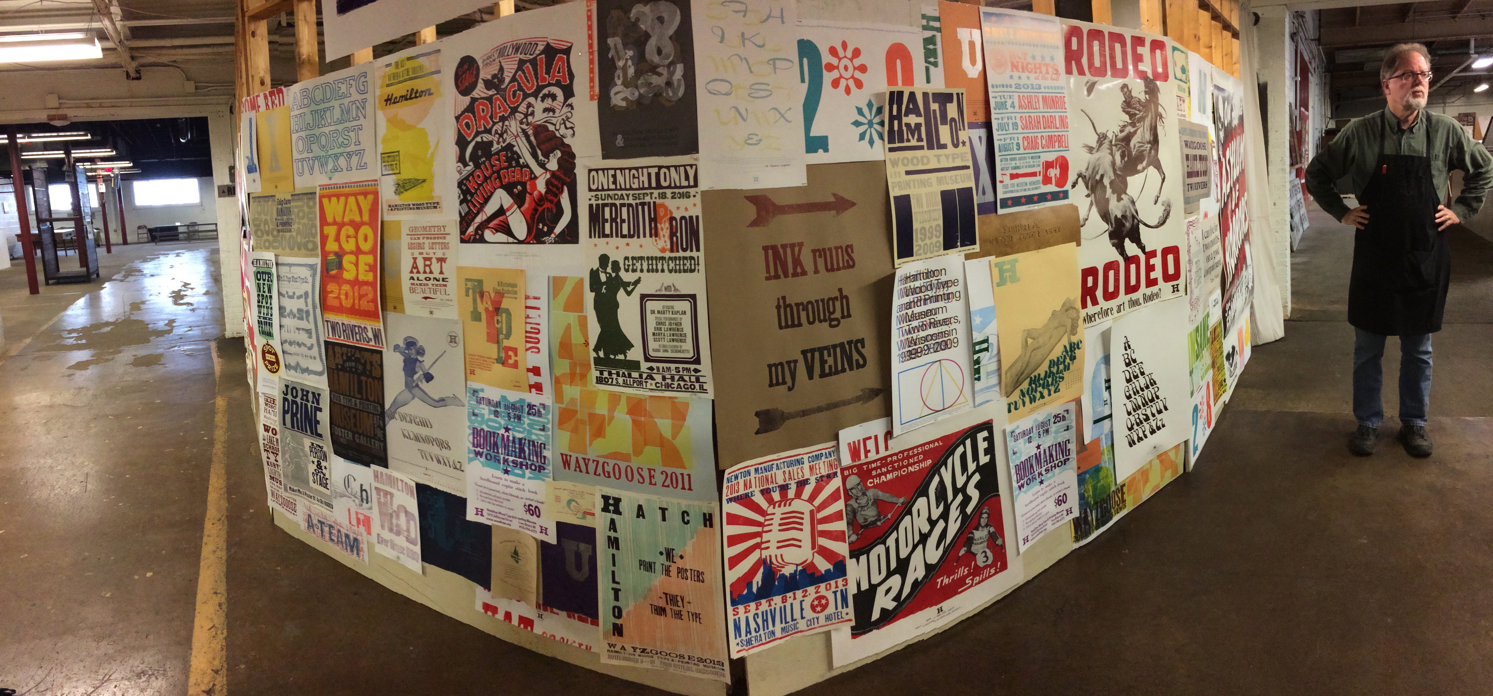
I bought this Hamilton flat file this week at the local thrift store. At first I passed on it, but my wife and
both convinced me I could figure out a way to get it to the studio. I drove back to the store and slapped down the business credit card.For those that don’t know, Hamilton was a wood type manufacturing company in the late 19th and 20th century. With explosive growth of the company, they expanded to make type cabinets “and other furniture useful in the press room, then to furniture for dental and medical offices and labs, drafting tables and furnishings, and the first gas-powered clothes dryer.”
Today, Hamilton is a wood type museum, still in Two Rivers, Wisconsin. I visited the museum with my Typography II class in college and it is one of my favorite memories.
I’m in the early planning stages of turning the first year of this newsletter into a book. I’m pretty busy so it might take a while, but I’m really excited about this idea. It’s going to include a selection of my favorite newsletters from the year, a selection of paywalled “How to Design a Book Cover” posts, and at least one book-exclusive essay. Oh, and lots and lots of pictures.
What I’m Working On
A new T-shirt for To Write Love On Her Arms and the nonprofit’s April Subscription box:

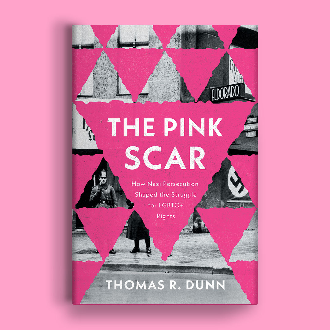
A new book cover for The Pink Scar: How Nazi Persecution Shaped the Struggle for LGBTQ+ Rights
¶ Thanks for reading! If you find this newsletter valuable and would like to support it, you can buy me a coffee or become a paying subscriber. Doing so helps me say no to designing soul-sucking books about corporate events, email marketing, and raising capital.
¶ These subscribers receive the How to Design a Book Cover series, a bonus newsletter breaking down the design of specific book covers from creative brief to approval. You can read the first post in the series for free here:

I recognize the irony of writing this online, where there is often not—and shouldn’t be, in my opinion—said space.
This is a bookshop.org affiliate link. I earn a small commission from a purchase made via this link.
From the Greek para-, “beside,” and grapein, “write.”
Never heard of "outdenting" and now I want to try formatting a fiction document where each paragraph starts with a five or six character outdent, which would expand into the margins (rather than merely indenting every line other than the first one of the paragraph) just as long as I can find a story that fits the typographical experiment.
I loved that book, and this is a great reminder - thank you!