I Want to be the Preeminent Designer of Midwest History Books
Is this what they mean by “niching down”?
I didn’t realize this until recently, but I am on something of a mission—a mission to become the preeminent designer of books about Midwest history.
I wrote this, as a joke, when sharing a book cover I designed for Minnesota Historical Society Press this past September. But shortly after writing it, I realized the words rang with truth.
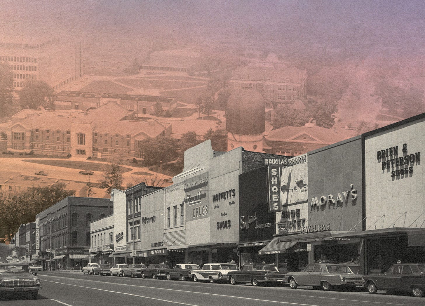
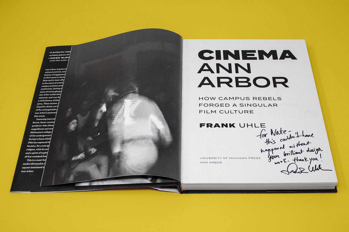
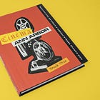
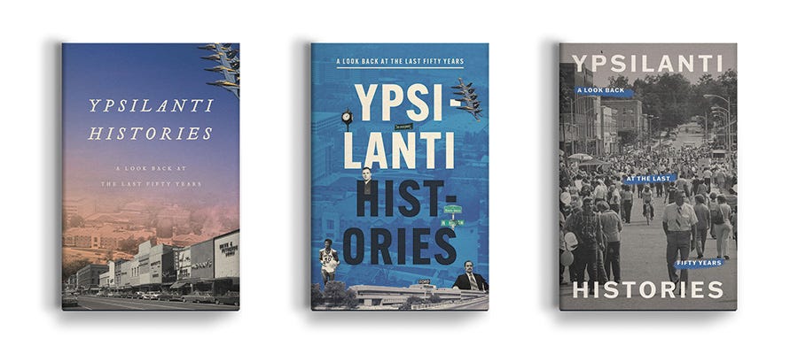
It all started with a big, red book about the movies. Alongside my colleagues at the Ann Arbor District Library, I designed the jacket and interior for Cinema Ann Arbor: How Campus Rebels Forged a Singular Film Culture. With over 300, high-resolution scans and photographs, designing the coffee table book was a dream project. Working on this book unlocked a new desire to design kick-ass, interesting books about the places I know and love. Shortly after Cinema, I got to design Ypsilanti Histories: A Look Back at the Last Fifty Years. Ypsilanti is the city adjacent to Ann Arbor and where I have lived since 2021. Two books about two cities in which I have lived in the same year? We’re off to a good start.
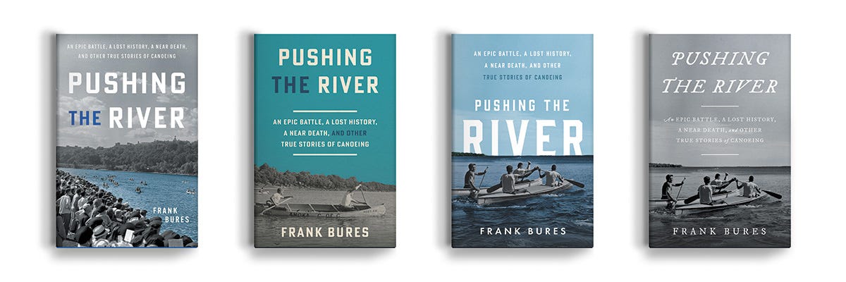
This year, I designed Family Foundations: Four Stories of Black Washtenaw County Community Building: 1850-1950 (Fifth Avenue Press) and Pushing the River: An Epic Battle, a Lost History, a Near Death, and Other True Canoeing Stories (Minnesota Historical Society Press).
There is a popular piece of advice in design communities to “niche,” or to focus your work into a particular subset of your industry in order to become an expert and therefore more valuable. I have too many interests and get bored too easily to be successful at this, and for whatever reason when I do niche,1 I am perpetually drawn to what are arguably the least profitable kinds. I suppose designing local history books is just the latest branch in my tree of design, graphic design, and book design.2
I don’t want to only design Midwest history books, though—variety is integral to my creative practice, and part of why I love my job at a public library—but local history as a genre does not receive much in the way of aesthetic TLC. I think in some small, or maybe big way,3 I can rectify that.
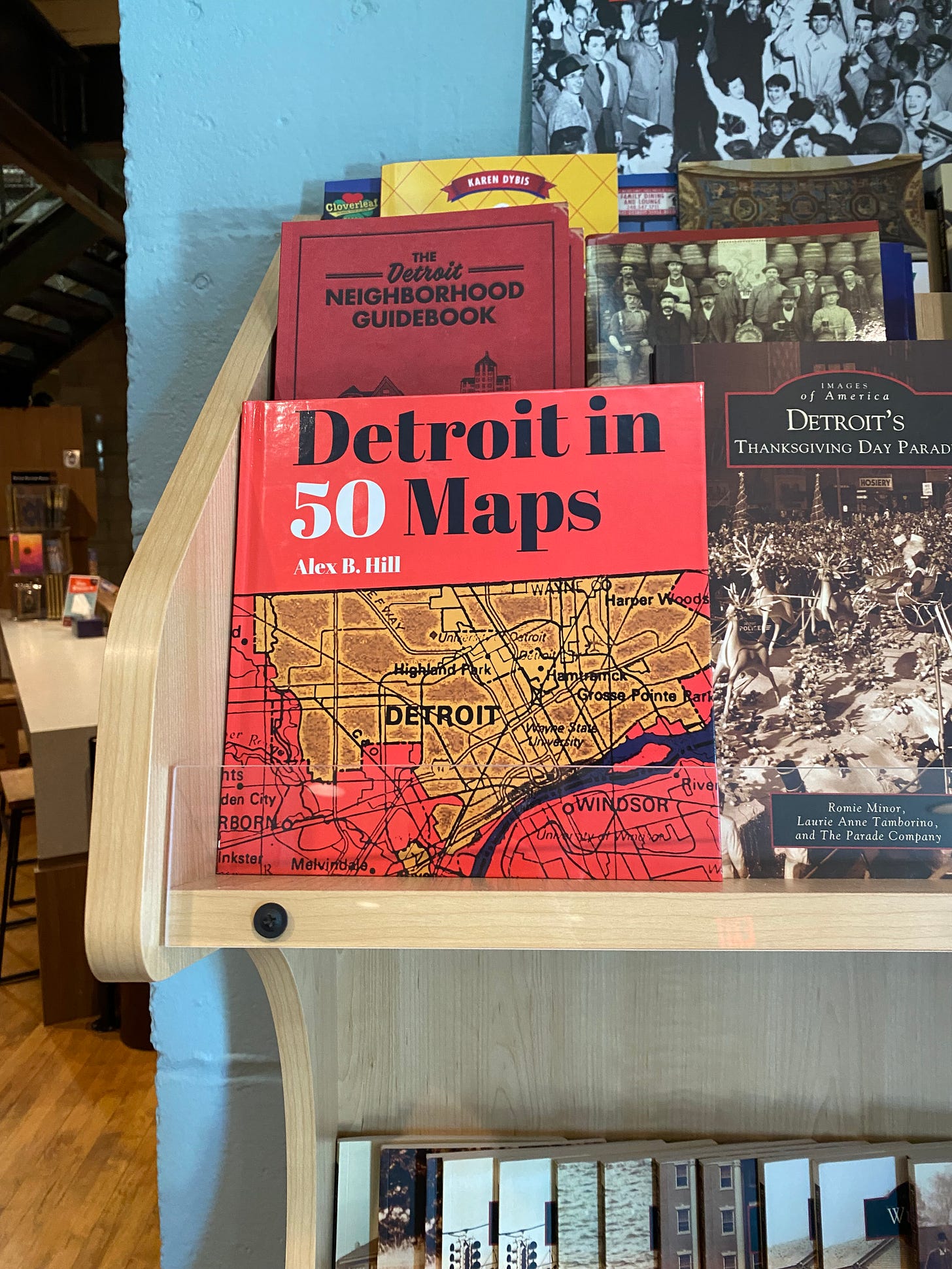
There are exceptions, of course: Anne Trubek and Belt Publishing produce beautiful and uniquely independent-looking books thanks to designers David Wilson and Meredith Pangrace. But by-and-large, “local history book” conjures the idea of sepia-toned images, templated covers, and poorly-set type.4
In a time when the Big Five increasingly only throw their weight behind projects with established supporter bases, book design for smaller projects becomes an increasingly important sales tool. It’s not the only factor in book sales, of course, and I recognize my own bias toward its importance. But it’s a mistake to discount its role in the success of publishers like Belt, Milkweed Editions, Coffee House Press, or college presses like Wayne State University Press.5
I’m not sure where I’m going with this! I guess, maybe, I just want to make it known; to put it out into the world. Call it manifesting if you believe in that kind of thing. Designing books about the Midwest and playing with old photographs makes me happy and I’d like to do more of it. Do you have a Midwest history book in you? Let’s talk!
Who knows—I had so much fun writing this history of a Midwest university yearbook’s name so much that maybe, one day, I’ll write my own book about some overlooked piece of Midwest history.
And, of course, I’ll design it too.
Here’s to more beautiful-looking Midwestern history books in 2025.
Until next time,
—Nathaniel
Colophon
A Book Designer’s Notebook is a newsletter about book design and creative practice from the desk of Nathaniel Roy.
It uses the typefaces Merriweather, Futura, and whatever fonts Substack has chosen. Merriweather is a Google font designed to be a text face that is pleasant to read on screens. Futura is geometric sans-serif designed by Paul Renner in 1927. It is on the moon.
Nathaniel Roy is a book designer, collage maker, photo taker, self publisher, and a few other things in Ypsilanti, Michigan.
You can see his work and hire him here.
Using this as a verb feels icky.
This is not to mention my work in newspaper and nonprofits and my interest in collage.
I did say “preeminent,” didn’t I?
Ironically, Belt was recently acquired by Arcadia Publishing, the publisher that produces those templated, sepia covers. But to their credit, they do publish lots of dynamic-looking, non-sepia books too!
They’re a client of mine, but the point stands regardless.




This feels not dissimilar to my journey as a publisher. It reminds me of hiking in the desert; sometimes, you realize you're being steered only after you look behind you. Very cool to see this from your perspective as a designer.
Seems to me by your list, you’re already meeting your description!