


The Best-Looking Self-Published Book I’ve Ever Seen
And How I Can Still Tell It Was Self-Published


The other day at the friends of the library bookstore, I picked up the best-looking self-published book I’ve ever seen.
Okay, maybe that’s not true. I saw
’s new book here on Substack, and that cover’s pretty great. designed a good one for The Midnight Vault, a recent anthology of Substack writers. I’m sure I’ve seen others. Let’s say it was the best-looking self-published book I’ve seen in “the wild.” Or, if you’ll allow one more caveat, the best-looking, self-published book I’ve seen in the wild that I could also tell was self-published. That’s not a great headline though, is it?I have what might be the world’s most useless superpower: I can tell your book was self-published.1 I wrote about how here and here.
I want to dissect the book I found—both why it’s great, and why I can still tell it was self-published. But first, some more thoughts on design and self-publishing.
Some more thoughts on design and self-publishing
After I posted “I Can Tell Your Book Was Self-Published,” I saw one response that said while they liked some of its points about typography, my “critique aspires to camouflage a book among the ‘real author’ published books and not as a creative work on its own merit.”2
To that I say: Yeah, basically.
If you publish a book, in any fashion, chances are you want it to sell. And if you want to sell a book, you need to meaningfully engage with the conventions of the publishing industry. Even if it is to buck them. I wrote this post with the average author in mind who is looking to sell books in a landscape that is accustomed to books hitting certain visual benchmarks.
But to this critiquer’s point, these are conventions. These are choices. And even if your goal is to “not look self-published,” the self-published author should think critically about these choices and not necessarily follow these conventions blindly, or for their own sake. And, and this writer reminds us, “not making a choice is also making a choice.”
I can tell a book was self-published because of poor design choices, but it is also often because of a lack of adherence to standards that a book is still clearly trying to meet. It is trying to clear a bar that it doesn’t fully see.
Like breaking the “rules” of graphic design, you should try to understand how and why you’re bucking convention and whether or not you want to.
Maybe you don’t want your book to look like a Big Five published it. Honestly, genuinely: more power to you. I hope my words can help you do that.
The Book in Question
The self-published book that caught my eye at the friends of the library shop is called Million Billion: Brief Essays on Snow Days, Spitwads, Bad Sandwiches, Dad Socks, Hairballs, Headbanging Bird Love, and Hope by
. The cover was designed by RT Vrieze, co-owner and creative director at Knorth Studios, a small creative studio out of Eau Claire, Wisconsin.Let’s first talk about what works about this cover, at least for me.

What works
I think there is a lot that works on this cover! If you know me, you know I’m a sucker for a collage on a cover. But even if it wasn’t my favorite aesthetic, I think this is a strong book cover.
Composition
The composition is beautifully layered. It begins with a fairly standard stock photo in the background—fields of something growing; I’m not a farmer—and fractures the image into a sort of gritty mosaic. There are specks and scratches visible on the sky and greenery. The cover adds further layering with three ripped labels of various size and color.3 The largest contains the book’s important information—notably on a white background—that doesn’t sacrifice clarity or legibility. The other two labels, in yellow and orange, contrast with the white, green, and blue really well, “popping” if you will, and are placed on a manner that looks both imperfect and well-considered. To use a term I just learned from
for something I’ve described haphazardly for years, there is some slight “tangenting” where the corners of the yellow and orange labels meet.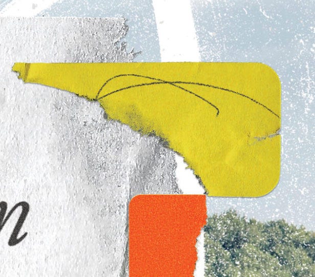
There are pen scribbles both on these labels and extending onto the background image and even beyond, onto the spine and back cover. To me, this solidifies and perpetuates the visual theme of imperfection I’m picking up on. The background image also extends onto the spine and back cover—something I try to do whenever I can myself—and slowly gives way to the back cover copy.
Typography
In contrast with the grittiness of the labels, pen scribbles, and ripped paper aesthetic on the cover, the typography is fairly restrained. This is smart. The typeface is an italic serif—something like a version of Garamond—which is a quieter choice that could be construed as more “literary.” The author name is in smaller roman, or non-italic type, and the subtitle is set in a workmanlike bold san serif with generous leading that fits the space on the orange label perfectly. Both of these typographic choices offer contrast to the book’s main title that are still complimentary.

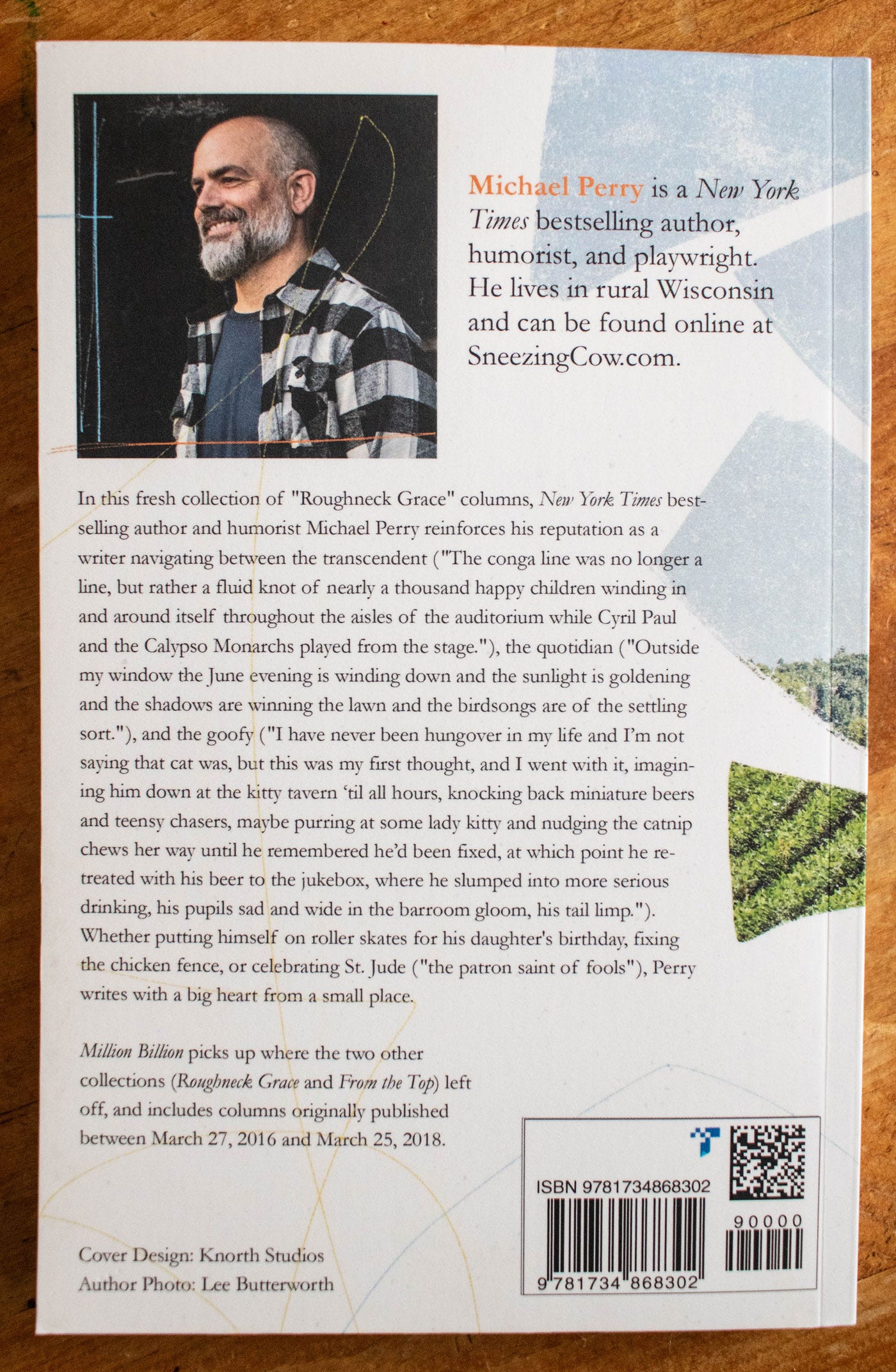
Back Cover
The back cover is a little less polished—we’ll get to that—but the author photo is good, and the author bio follows the convention of highlighting the author’s name with either scale or color. As I mentioned, the pen scribbles and ripped background image continue onto the back from the front, overlapping elements and unifying the cover in a really pleasing way.
How can I tell it was self-published?
Print-on-Demand
Right off the bat, the book has that waxy, matte coating on the cover paper stock that has become synonymous with print-on-demand publishing. There’s a slightly fuzzy lack of fidelity to the image, and this is particularly notable on the title’s black type. We can tell this one comes from Amazon KDP because of the funky barcode on the back cover, and the requisite KDP barcode on one of the final interior pages that tells you where the book was printed. But I don’t think the KDP-ness of the book really counts against it too much here. If anything, the slightly fuzzy image works conceptually for this cover, and there are other credibility markers that offset the signs of POD like the quality of cover design and the “New York Times bestseller” reading line. And besides, traditional publishers have also been known to use POD to shore up print run numbers for in-demand books.
Cover Copy Editing
Speaking of this reading line, however, another indicator of self-publishing, or just an editing oversight, is that “bestselling author” is in italics in addition to the New York Times. Only the newspaper name should be in italics. Most publishing houses would catch this subtle mistake before publication.

Spine
One major indicator of a self-published book is a lack of publishing imprint colophon, or logo, on the book’s spine. This is one of those industry conventions we talked about—you just won’t see a traditionally published book without a logo on the spine. That being said, I think this is a well-designed spine and I love the carry-over from the front cover. I think a well-designed spine without a colophon is better than a poorly-designed one with a colophon.

Back Cover Typography
Continuing the examination of typography, we move to the back cover, where the text is set in one, large, left-aligned block. This isn’t bad, but keeping the text in a single block this large does go against convention. There are usually a couple paragraphs, or a heading that leads into the copy. Back cover copy is also generally justified, but left-aligned copy is not completely unprecedented and isn’t really a knock here.
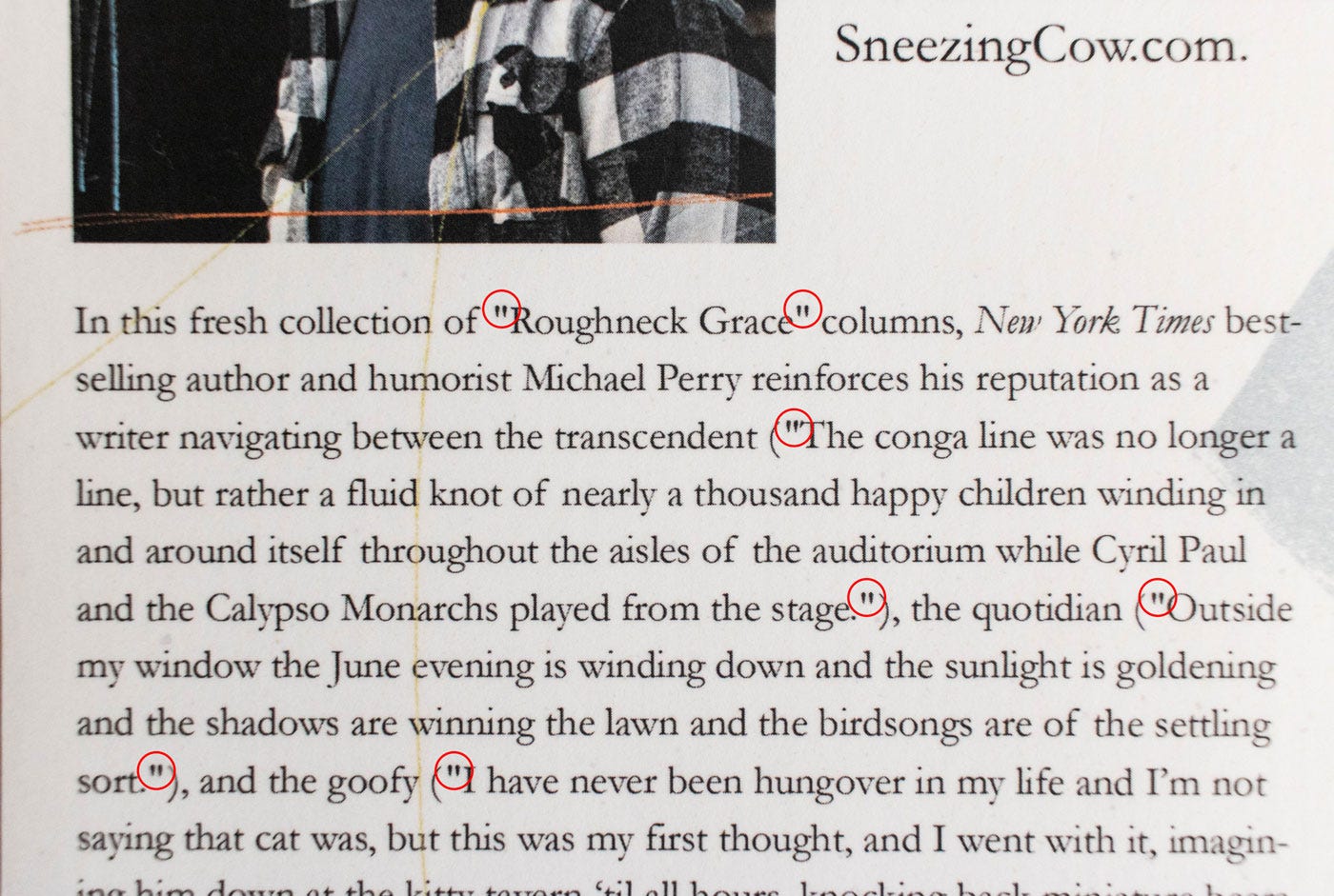
One real typographic mistake here, albeit a small one in the grand scheme of things, are the straight quote marks instead of curly, or typographer’s, quotes.
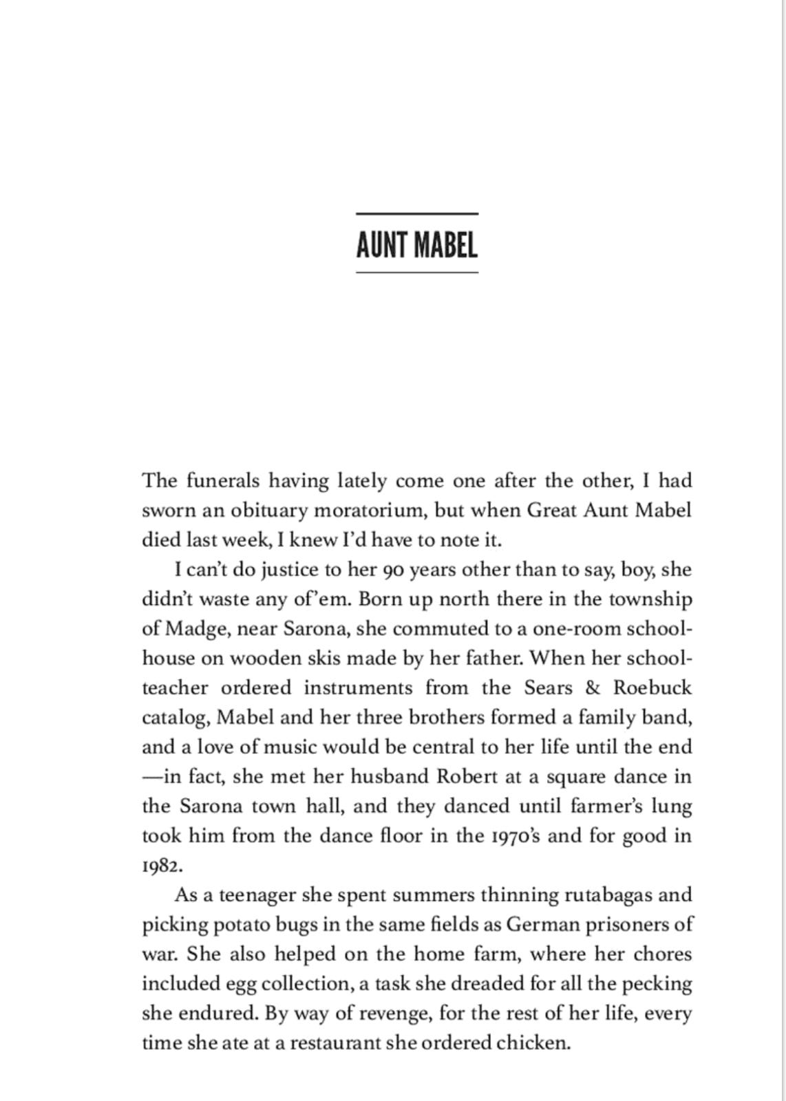
Interior Typography
The interior typography and layout isn’t bad at all! It’s just that I can tell it was designed with a program, popular withs self-publishers, called Vellum. Vellum is a tool specifically for typesetting and interior design. It has some limitations if your layout is complex, but it’s actually a really handy tool for those that don’t want to get into the weeds of InDesign and can’t pay for a professional book designer. I can tell it was designed with Vellum because while they have added many more design styles in the last few years, this book’s heading type, with its horizontal bars, is a popular and distinctive choice. I recognize that I am a weirdo and that 99% of people will not be able to tell what program this book was designed in or that it indicates self-publishing.

There you have it. This is, admittedly, in the weeds and quite nitpicky. But design is in the details—and I hope examining these details is illustrative for those reading that are interested in design and self-publishing.
Some other notes:
While this book is self-published, Perry is a prolific author who has traditionally published books with both HarperCollins and Wisconsin Historical Society Press.
This book was well-designed by a good designer, but not necessarily a publishing veteran. The differences are subtle, but present—keep this in mind when hiring a designer for your book!
Here’s a blog post from the author about the book cover, showing some alternate options.
I’ve actually used Vellum and I recommend it. If you’d like to support this newsletter, you can buy Vellum (Mac OS only) with my link below. I get a 20% commission. Thanks!


The Latest for Paid Subscribers

In her exceptional debut collection of poems, Molly Raynor welcomes you to sit at the table with her ancestors, mothers, sisters, friends, and wild women, as she glues together moving memories of waxy-lipped kisses, and potato peel dresses. Ghosts of the old country, lost loves, and the unborn haunt ZAFTIG. Raynor’s poems are imbued with deep Judaic traditions, and a sprinkle of Yiddish. They burst forth with sensuality, survival, and the push-pull of women’s bodies as coveted flesh. Braiding together words like bread to lay on the table in honor of the beauty & the terror of living, these poems breathe new life. Inspired by the past, but firmly planted in the present, ZAFTIG joyfully takes up space like the powerful women who fill Raynor’s heart and words.
What I’m Reading (books)
Persepolis Rising by James S.A. Corey
What I’m Reading (links)
How reproduction and technological distortion can spiral into surreal chaos by
how I'm thinking about cover reveals right now by
How One Idea Sparks Creativity: Writing, Teaching & Innovation by
What I’m Working On
A recent collage:

I love making simple collages with a surrealist bent—I work hard to find pieces that fit together just so.
Then I scan them and bring them into Photoshop for some subtle blending techniques to make the elements look like they belong together even more: make grayscale, add some noise, add a subtle paper texture.
I’m doing some freelance work for To Write Love On Her Arms, a nonprofit movement dedicated to presenting hope and finding help for people struggling with depression, addiction, self-injury and suicide. I interned there ten years ago and so it feels very full circle. I’ll share the shirt I designed for the April subscription box very soon.

Thanks for Reading!
Thank you for reading! I mean it.
If you’d like to keep this newsletter going and help me say no to designing soul-sucking books about corporate events, email marketing, and raising capital, consider becoming a paid subscriber or buying me a coffee.
Paid subscribers get access to How to Design a Book Cover, a bonus series illuminating my book design process, and Book Design Critiques, a bonus series in which I kindly and candidly critique a paid subscriber’s book design.


Related Reads


Some people can make phone calls without having anxiety. Much more useful.
I’m not linking to this writer or this post because I found much of his work questionable.
Want to know something crazy? I know exactly where the designer got these sticker images from, because I have the same file. They’re from a free Photoshop file from BLKMARKET.
An interesting read! I think a lot of indieauthors don't realize the importance of conventions and just think 'it's my book, I'll do the cover how I want to' and then they wonder why their book isn't selling well. Bucking conventions and even cover trends is fine, but to do it well you still need to be informed by them and not simply ignoring them. It's a 'know the rules to break the rules' scenario. Subversion of 'rules' is a huge part of art and design, but it requires an exceptional level of understanding of those 'rules' in order to pull it off.
On the topic of the interior design, I specifically chose Affinity Publisher for doing my last book's typesetting and design so that I could play in the weeds! I wanted to get fancier with my interior design than the programs that most indies use are able to do and so picked what was the closest comparable to the industry standard I could find. (I have issues with Adobe, so didn't want to commit to InDesign if there was a good way around it).
I do wish KDP wouldn't print that KDP barcode on the interior page though! Alas, I don't think that will ever change as I'm sure there's a reason for it. It just annoys me to see it.
I was finally able to get to this piece. Solid crit, Nathaniel. It's definitely a good-looking cover, and I can't get enough of the scuffs, scratches, and pen marks. The quote mark thing, though...it's a big peeve of mine so it really stands out to me. But it's also a very common mistake. Very small ding on a great cover.
Fun read overall. Keep putting this stuff out there. These crits provide a lot of learnings for anyone looking to self-publish.
And thank you for the Midnight Vault cover callout. Appreciate the mention and the kind words, friend.