My Favorite Rejected Book Covers
And Why They Weren't Published
Thanks to Simone D. Casadei Bernardi (among others) for inspiring this post.
Behind every best-selling book, there is a group of covers that will never see paper, ink, or the bright glow of a TikTok influencer’s ring light. I’ve not yet designed a bestseller, but I have designed many books, and every single time I have created more than one cover.
It’s part of the business. Publishers and authors want options—and to a point, I think this is a good thing. In my experience, iteration is essential for discovering better design solutions. And these days, my process is such that if I don’t have more than one decent idea for a cover, I should probably not be designing that book.
In addition to meeting expectations for a number of options from a publisher, more versions of a cover often shake loose in the revisions process. Sometimes these are slight variations, and sometimes they are completely new designs. Like everything else about book design, it depends.
There are dozens of reasons for a book cover to be chosen or rejected—or “killed,” as the industry parlance goes—and only some of them have to do with the quality of their design. Inevitably, there are favorites that end up on the cutting room floor. But these days, thanks to the red, green, and blue magic of our screens, these covers can enjoy a second life on websites, social media, and newsletters like this one.
Here are some of my favorite unused cover designs and the ones that usurped them.
(Rejected covers are on the left, published on the right.)
The Second Emancipation
Why was it rejected? The book’s editor and author thought this cover looked too much like a straight biography of Kwame Nkrumah, when the book has a broader narrative. Which I think is fair criticism! I’m very happy with this final cover.
Law, Justice, and Society in the Medieval World
Why was it rejected? The authors had a particular vision for the cover of this book, and it was one that did not include blackletter—or Old English—typography. The press was also not completely sold on my distortion of the figures as a representation of the discussed films being “stylized, and often distorted, mirror(s)” of medieval law and justice. Which, fair. But this might be my favorite unused cover of all-time. Until the next one, that is.
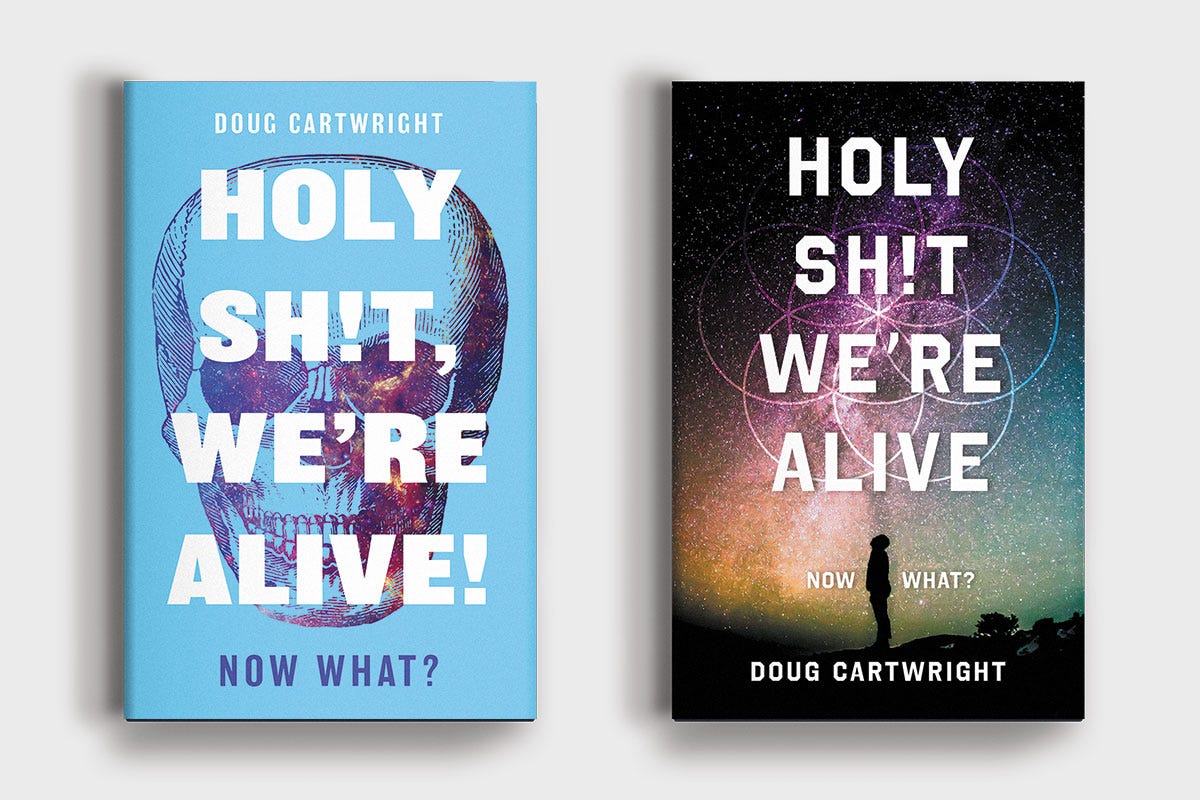
Holy Sh!t We’re Alive
Why was it rejected? The author was uninterested in a skull, and the concept of death in general, representing the notion of “being alive.” Again, he had a particular vision for this book and a specific style of image he wanted to use.
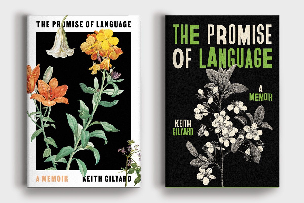
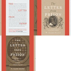
The Promise of Language
Why was it rejected? Some covers are not rejected, they are just simply not chosen. I generally try not to be cocky, but for this book, I think I knocked it out of the park. I have several unused favorites for this book, but I am also quite happy with the chosen cover. The published cover visually references one of the author’s previously published books to which this memoir is something of a follow-up.
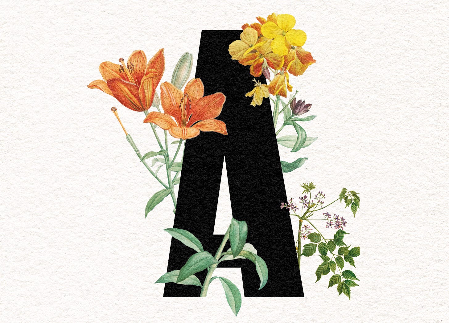
Why was it rejected? The publisher didn’t buy into the idea of the letter “A” as a representation for the concept of language. But they liked the flowers! Sometimes ideas just don’t connect, even if the cover looks nice.
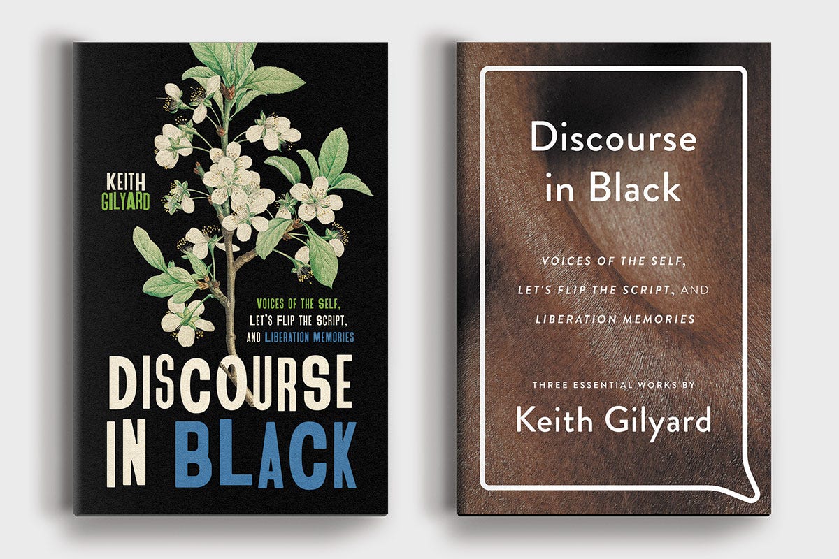
Discourse in Black
Why was it rejected? This book is a compendium of three of the author’s earlier works and is set to be released in the same season as The Promise of Language. One of the directions we explored was tying the books together visually, but ultimately, the press decided to go with a new design that represented the title more than its connection to the other book.
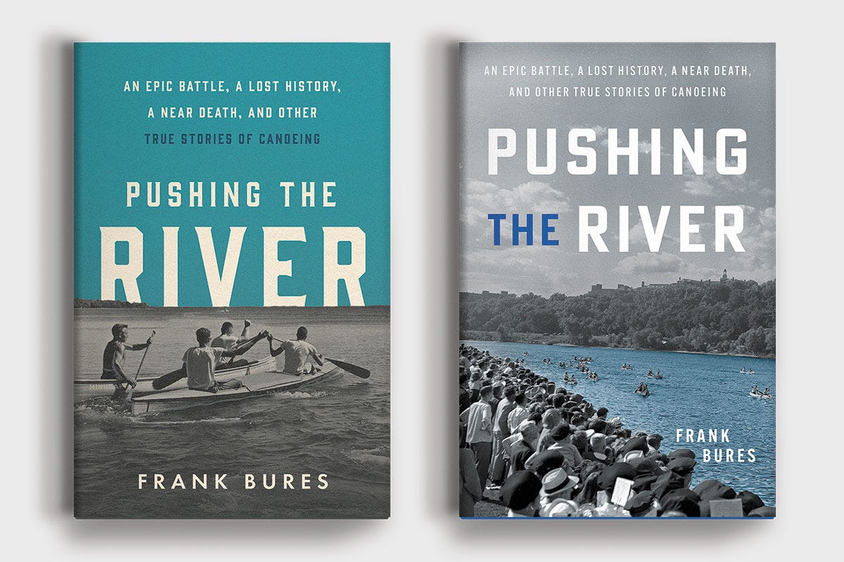
Pushing the River
Why was it rejected? The publisher was happy with all of the options I provided for this title, they simply had a preference for the image in the published cover. We tried several type treatments borrowing from unused comps.
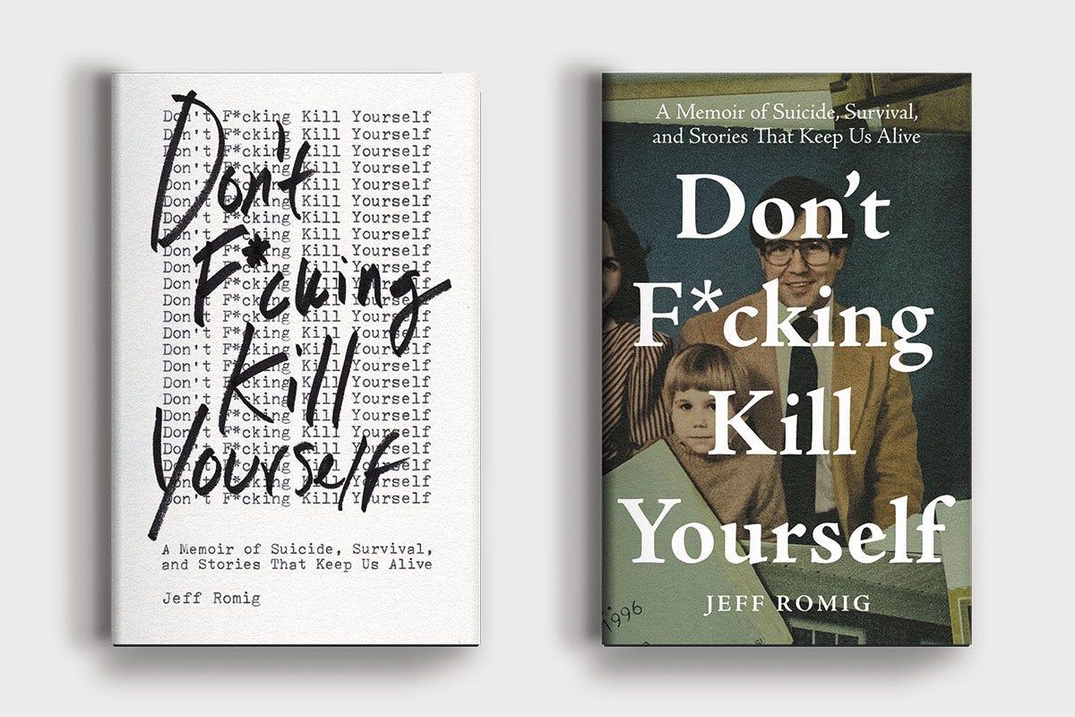
Don’t F*cking Kill Yourself
Why was it rejected? The author had a strong, emotional reaction to the cover that would eventually be published. His father’s suicide, and his own struggles with suicide and depression were at the heart of this memoir.
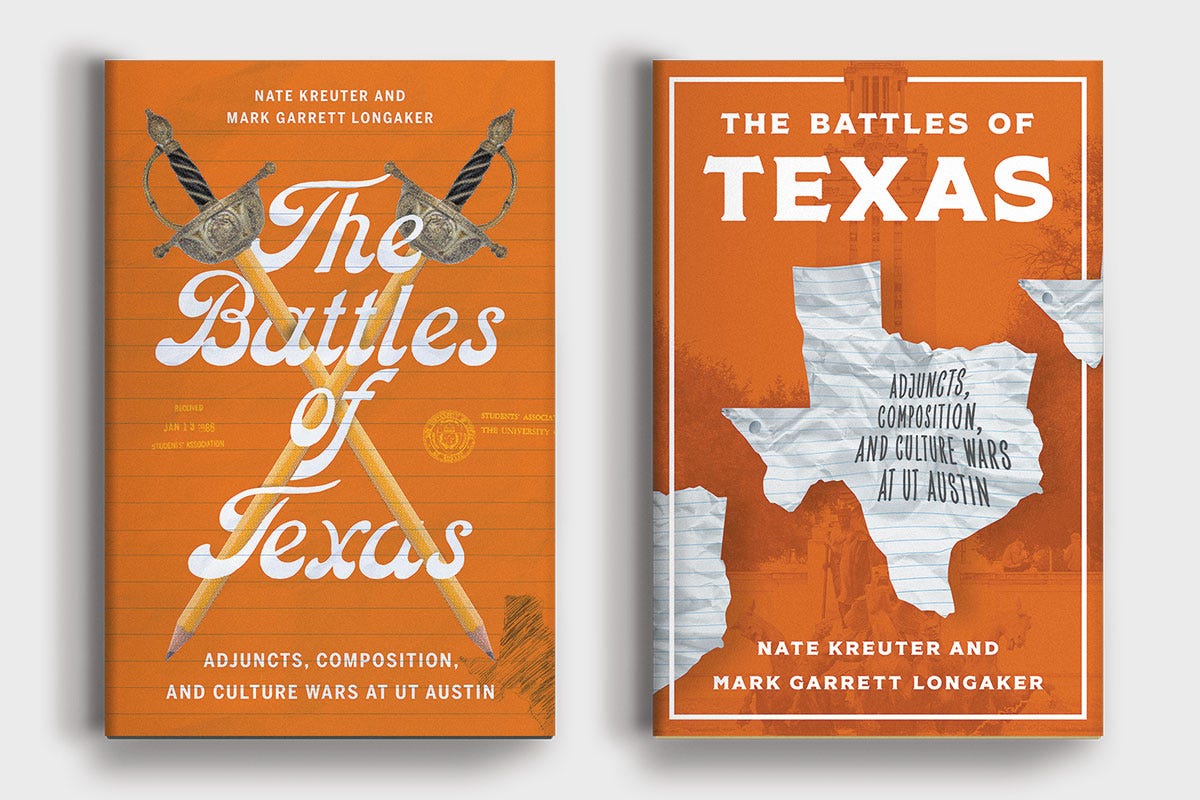
The Battles of Texas
Why was it rejected? Again, the publisher was happy with all of my options and this was a matter of preference rather than rejection.1 The press was split and left the decision to the authors, who chose the cover on the right. I like the chosen cover, but I love this unused one.
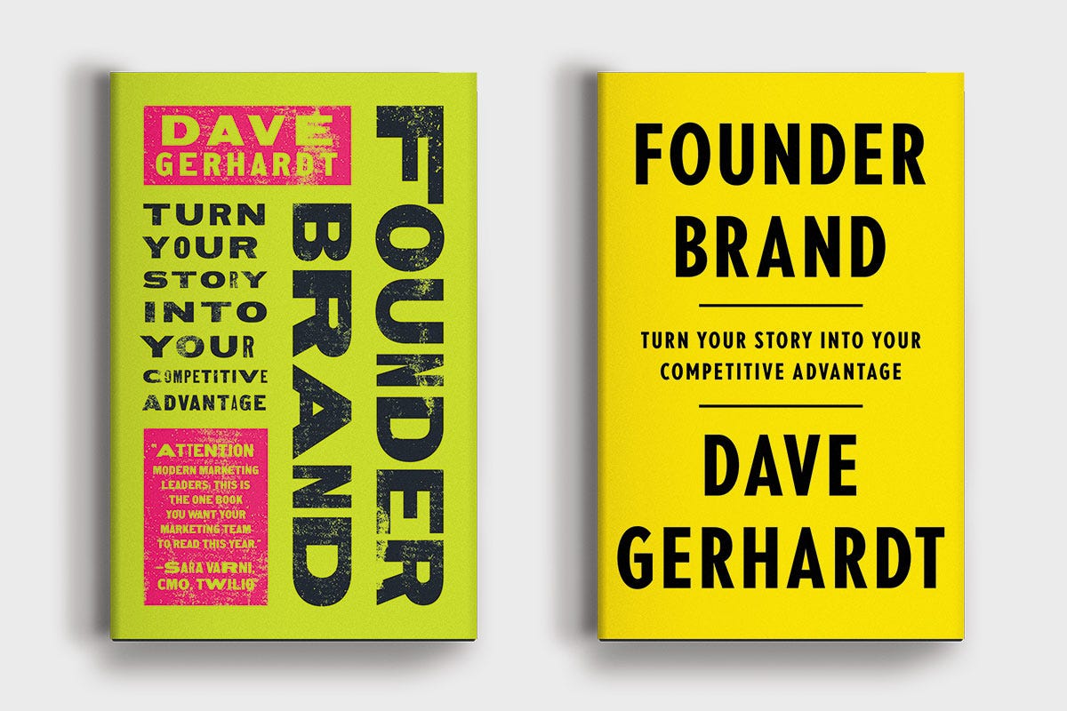
Founder Brand
Why was it rejected? The author wanted a clean, classic, authoritative cover. I had fun with this rejected one, but looking back I think the right choice was made here.
New-School Millionaire
Why was it rejected? I’m not actually sure this book was published. Some stuff went down with its publisher. But the cover on the right was the final choice during my time working on this title. The author had a great photoshoot and ultimately decided to put herself on the cover emphasizing “new-school” with her own personal style.
In My Skin
Why was it rejected? Another attempt at repeated typewriter text rejected! Alas. The author liked this unused cover, but preferred the repeated handwriting overlayed upon the figure as seen in the final cover.
Do you love looking at rejected book covers? I have good news: Instagram is absolutely rife with book designers sharing their rejected work. You’ll probably even see a few for books you’ve actually heard of. Do yourself a favor and grab one of your favorite books off the shelf and see who designed it—book covers are one of the few places in graphic design where the designer is credited on the package.2 Grab enough of them and I am confident you’ll find a designer sharing their rejected work. Then, if you’re insatiable, you can check out who they are following and get some more goodness in your feed.
The Book Designers are incredibly prolific and make me feel bad about my output. David Drummond shows preliminary sketches that are incredibly clever and thoughtful. Elisha Zepeda might be the world’s most famous book designer thanks to his TikTok’s and reels that animate his cover process. The incredible Arsh Raziuddin occasionally shares covers that didn’t make the cut and I am not jealous of her skill at all. I could go on.
What do you think? Do you like any of these rejects better than their published counterparts?
Thanks for reading! If you love this newsletter and want to support it, you can do so by “buying me a coffee” or becoming a paid subscriber.
Paid subscribers get access to How to Design a Book Cover, a bonus bi-weekly series in which I break down my book cover designs from creative brief to final cover. You can read the first post in the series for free here:
Until next time,
—N
This has been a big year for that.
Maybe THAT’S why I do this.







38-year art director here.
I was struck by how the majority of your passed over covers were vastly superior to the final ‘product’ — which for most of them turned the design into a safe, pedestrian generic thing.
Proof that most authors should remain writers and not graphic designers. Not that all of them had a say, but you get my point.
Fabulous post.
Tell me about the font for The Battles of Texas. Looks gorgeous