I Critiqued This Substacker's Book Cover
'Windsor Greetings' by Michael Macfadden
Hello! This is a special Monday edition of A Book Designer’s Notebook, the newsletter about book design and creative practice from the desk of Nathaniel Roy.
New around these parts? Start here:
Critique is essential to successful graphic design.
But it can be damn hard to take. This is, in part, why it’s so important. In my own work, critique has made me a better designer in two ways:
By following the feedback of others, my design work has improved. Other people see things you don’t when you’ve been staring at the same thing for hours. Other people see things you won’t see for years.
Repeated critique has provided me with the metaphorical callouses necessary for a life of creative work. Sure, I occasionally step on a tack that renders those callouses useless, and need to cuss and moan and contemplate quitting this entire endeavor. But generally, critique has allowed me to take things less personally and keep moving. The more my work is critiqued, the better I get, and the more I then get out of critique.1 Like reps at the gym.
Michael Macfadden understands this. Recently, he sought me out specifically to critique a few cover options for his forthcoming novella, Windsor Greetings. Macfadden, a high school teacher, writes an eponymous newsletter about creativity and innovation in teaching and learning. As a working designer often in a freelance role, I don’t often get to play art director, so I relished the opportunity to collaborate and give my thoughts on Michael’s design work. Kudos to Michael for doing the uncomfortable work to make his design better.
On with the critique!
Michael and I both are sharing this with our respective readers. Read his perspective on the critique—and see his revisions—in his newsletter!
Here’s a spoiler-free summary of the book, courtesy of the author:
Windsor Greetings follows the Windsor family as they grapple with deep-seated tensions, personal betrayals, and the challenge of transforming their artisanal greeting card company in a rapidly evolving industry. Alex, the ambitious youngest son, returns to the family fold with a vision to transform the business, clashing with his brother Tyler, whose questionable decisions have worsened the company's decline. A sudden family tragedy shifts the balance of power, forcing the family to reckon with their shared history and the future of their legacy. Set against the backdrop of a changing industry, the story weaves themes of innovation, loyalty, and the complexities of familial bonds.
Cover 1
First Impression
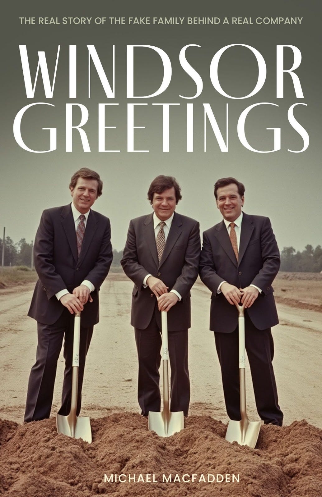
The image on this cover gives me the impression of satire or comedy. Like a history of the Bluth company from Arrested Development. Maybe it’s the vintage, greenish color palette and the slightly goofy affect of these men in suits with wavy hair. I’m into it!
Critique
Imagery:
If you look closely, particularly at the fingers and eyes of these figures, you can tell this image was AI-generated. I am generally against the use of AI-generated imagery in book covers for its ethical implications, but I won’t hold that against Michael here. However, I think if you’re going to use it, it’s got to work at the detailed level. If dead eyes and mangled fingers are meant to be part of this cover, I think they need to look more intentional.
Typography:
The title typography does a solid job of matching the vintage aesthetic of the image. However if the book is satirical or comical—I don’t know yet—I might explore using a more contemporary typeface, or even handlettering, to contrast with the image and better indicate this editorial position.
“Windsor” looks slightly larger here, probably to even out the line lengths of the title. Most probably won’t notice consciously, but I think this gives a slightly unbalanced feeling. I would probably make “Windsor” the same size as “Greetings,” increasing the leading a bit, and possibly scale the entire title down a touch so that it occupies a similar total area.
I think the author title here feels a little bit like an afterthought. Small can be okay, but I think more can be done here to integrate the author name. Maybe size, maybe font, maybe somehow incorporating the words into the dirt somehow?
To get really nit picky for a second: the kerning between the “P” and “A” in “company” in the subtitle is a too big in comparison to the rest of the letters. When typesetting, special attention is often needed for kerning those letter A’s!
Thoughts After Reading the Book Summary
The summary provided by Michael reads as more earnest than my initial interpretation of this cover. That’s not to say that mine is the only, or best reading of it! I wonder if the stiffness of the artificial intelligence, as well as the creepy eyes and mangled fingers, lent a more sardonic vibe to the cover than intended. Michael also confirmed that the story takes place in the present day, which feels a little at odds with the vibe of the image. I think knowing this, I would change the title typeface to be more contemporary looking in order to achieve better contrast with the image.
Cover 2
First Impression
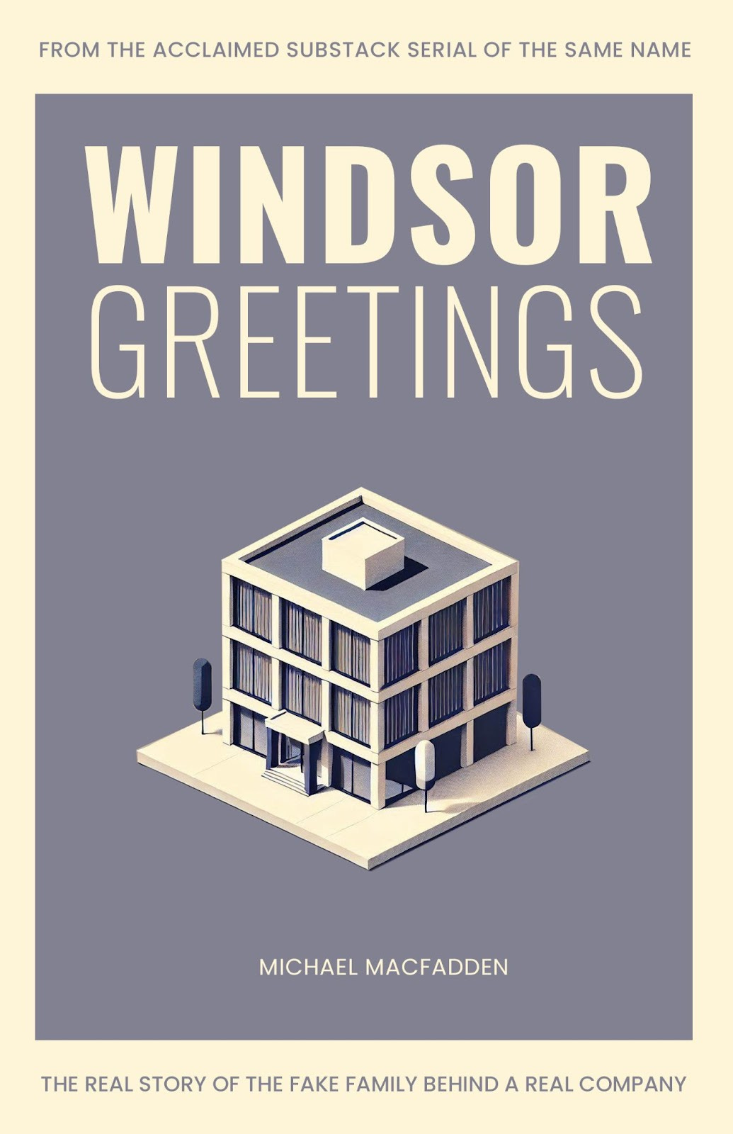
I get slight Severance vibes from this cover! I think this is due to the color palette, modern typography, emphasis on a geometric building that almost looks like a miniature, and the illustration style. There’s a mid-century cleanliness here that I like and wonder how it represents the story. Is the language sparse and direct? Or should there be something present in the cover that subverts this cleanliness?
Critique
Imagery:
Looking at the blinds, it appears that this image is again AI-generated, however I think it looks less blatantly so.
I’m intrigued by the main image—it’s small for a building. A little awkward, stunted. Is this intentional, or a byproduct of inexact prompting? It gives the impression of being a toy or miniature. Does this play into themes of power and control in the book? If so, a hand breaking the border plane might help drive this theme home as well as introduce some dynamism to what is otherwise a fairly static, but still strong, composition.
Typography:
“Windsor” looks larger again here, but this time it works for me because it is a different weight than “Greetings” and therefore has enough contrast as to not cause visual friction.
Again, the author name is small. I think it works better here because there is better legibility than the previous cover, however I still might want to see it increase in size in order to provide a sense of hierarchy between the author name, the subtitle, and tagline.
Thoughts After Reading the Book Summary
After reading the summary, I think this cover works pretty well. But because the family owns a greeting card company, I would love to see that incorporated somehow, maybe into the building, in a way that tailors the image more to the story and looks a little less generic.
Cover 3
First Impression
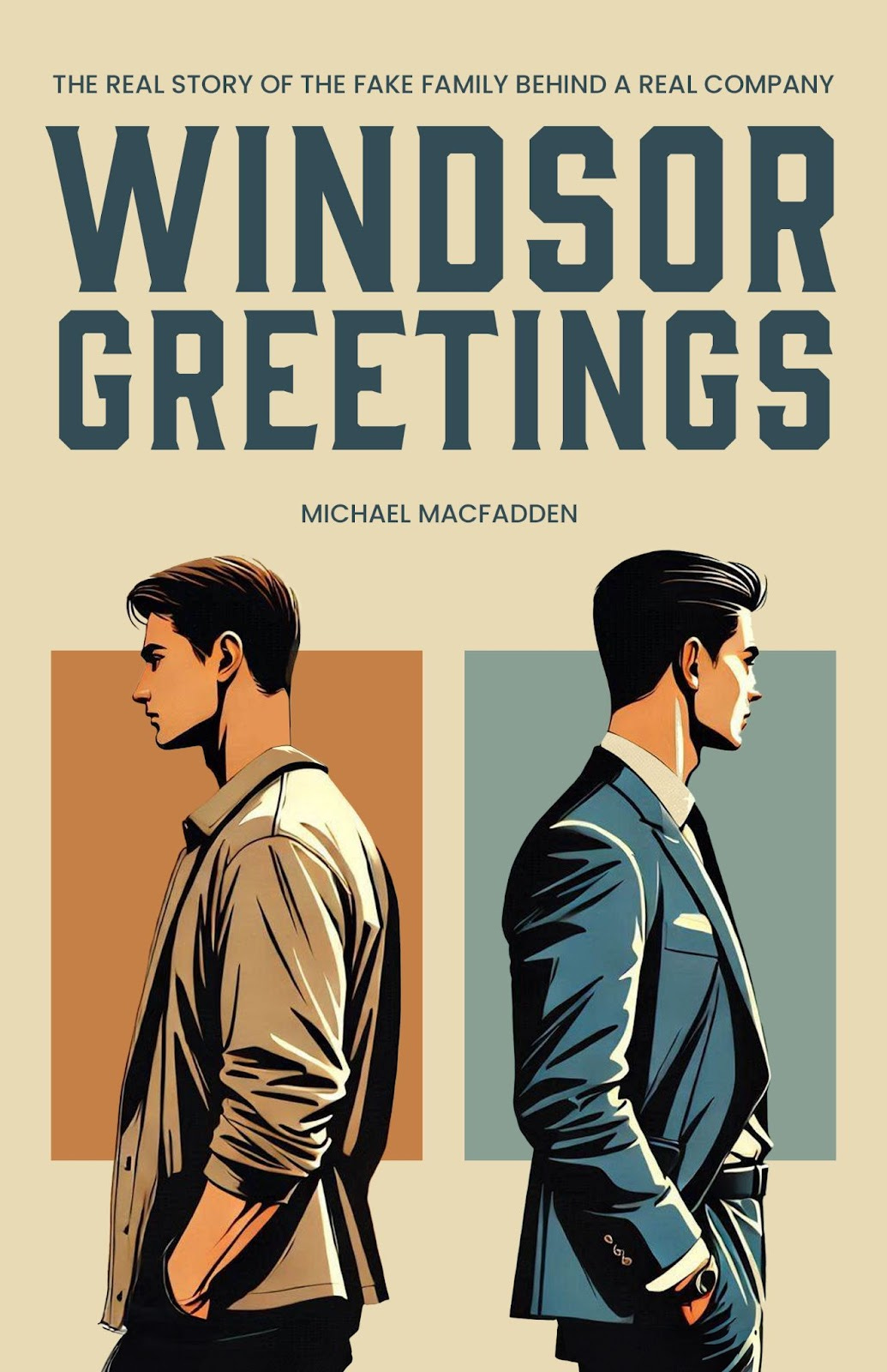
Cain and Abel. East of Eden. Brothers in disagreement, choosing different life paths. More vintage vibes here, thanks to the title typeface.
Critique
Imagery:
I like the composition and colors here.
This isn’t right or wrong, but generally, full-ish figure illustrations like this are often associated with the romance genre. We may dislike tropes, and tropes may change, but they are something we need to take into account when designing a book cover that we hope sells our book.
The illustration style reminds me a bit of anime. Maybe this is because I am dumb. But I am willing to bet it might also remind a general audience of anime! Is this intentional? Is it desired? It’s not inherently a bad thing.
I’m not sure if this illustration is AI-generated, but I’m willing to bet it is based on the other two covers. This does a better job of hiding it, though there are a few fixable, detailed flaws: there’s a chunk missing from the nose on the figure on the right, and the figure on the left’s head is a touch see through and the sharp edge of brown plane behind him is visible.
Typography:
My critique of the typography here is largely the same as the others:
I’d standardize the size and slightly increase the leading of the two words in the title
Adjust the kerning of the subtitle
The size/placement of the author name doesn’t work for me. This one really feels like you weren’t sure where to put the author name! To get bigger, it would likely need to move or necessitate an adjustment to the composition, but right now it feels squeezed in as an afterthought.
Thoughts After Reading the Book Summary
While I love—and have used—the title typeface here, Gin, I think that knowing the story is contemporary, I would tweak the font. The illustration here feels probably the most contemporary of all of the options and I think there might be a typeface that better matches this aspect of the book.
This cover most clearly communicates the conflict between the two brothers in the story.
Want me to critique your cover like this? Fill out this form.
For a fee of $100, I will provide a detailed critique featuring my first impression of your cover, analysis of what works and doesn't work, and one follow-up Q&A email.
Overall thoughts:
Though I would be able to tell these book covers were self-published, they are better than a lot of self-published fare.
Strengths: I think these covers have strength in their overall compositions, color palettes, and thoughtfulness behind their font choices.
Weaknesses: I think they have some weakness in their use of obviously AI-generated imagery, some nitpicky typesetting details like leading and kerning, and a general lack of cohesion when it comes to the author name on each cover.
I think covers 2 and 3 are the most successful. Cover 1 has an interesting energy, but ultimately looks the most “vintage” of the three and also is the most AI-generated, which I think is distracting from a book cover’s purpose to represent and sell the book.
Let’s get meta: what do you think? Critique my critique with a comment.
Thanks for reading! If you love this newsletter and want to support it, you can do so by “buying me a coffee” or becoming a paid subscriber.
Paid subscribers get access to How to Design a Book Cover, a bonus bi-weekly series in which I break down my book cover designs from creative brief to final cover. You can read the first post in the series for free here:
This is, in part, why I worry for designers who didn’t go to school.





Great critique, Nathaniel. I felt like you read my designer mind with your comments about these covers. I also got a Severance vibe about the first two, which is not bad, but not sure that’s what this author intended. Third cover reminded me of a Hardy Boys Mystery cover.
I think these critiques are so helpful for authors. It would be cool to see an author either take your advice and revise covers or even better, hire you to do your full process, then see the entire spread of covers.
This was a fun read! I rarely get to design fiction so it was interesting to hear how you think about imagery/look/feel a bit differently than non-fiction/academic. Critique is an underrated skill. Being able to do it effectively and being able to accept it effectively are both things that require practice. And callouses. Love it! Happy new year, Nathaniel!