Hello! Welcome to How to Build a Book Cover, a new series from A Book Designer’s Notebook in which I walk you through a particular cover design from start to finish. This is the first free post in what will otherwise be a bonus series for paid-tier subscribers.1 To celebrate the start of this series, you can get 20% off a paid subscription from now until the end of the year.
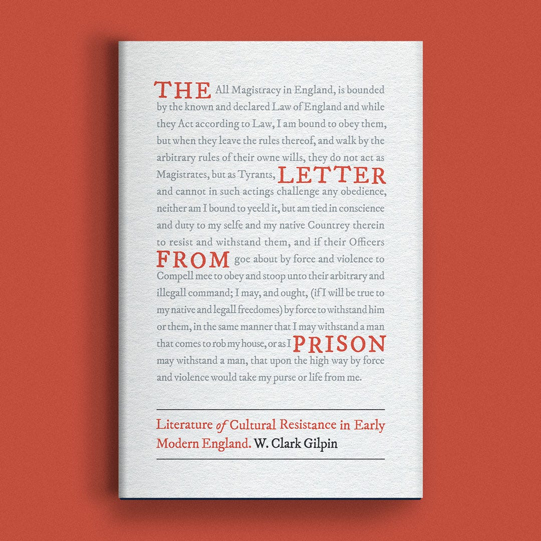
This week, I’m sharing the process behind my cover for The Letter from Prison: Literature of Cultural Resistance in Early Modern England by W. Clark Gilpin.
The Brief
When I work with publishers, I receive a creative brief that usually shares a description of the book, technical specifications, potential art direction from the author, and art direction from the press itself.
Official Book Synopsis
Letters from prison testifying to deeply felt ethical principles have a long history, extending from antiquity to the present day. In the early modern era, the rise of printing houses helped turn these letters into a powerful form of political and religious resistance. W. Clark Gilpin's fascinating book examines how letter writers in England--ranging from archbishops to Quaker women--consolidated the prison letter as a literary form.
Drawing from a large collection of printed prison letters written from the reign of Henry VIII to the closing decades of the seventeenth century, Gilpin explores the genre's many facets within evolving contexts of reformation and revolution. The writers of these letters portrayed the prisoner of conscience as a distinct persona and the prison as a place of redemptive suffering where bearing witness had the power to change society.
The Letter from Prison features a diverse cast of characters and a literary genre that combines drama and inspiration. It is sure to appeal to those interested in early modern England, prison literature, and cultural forms of resistance.
Notes from the Author:
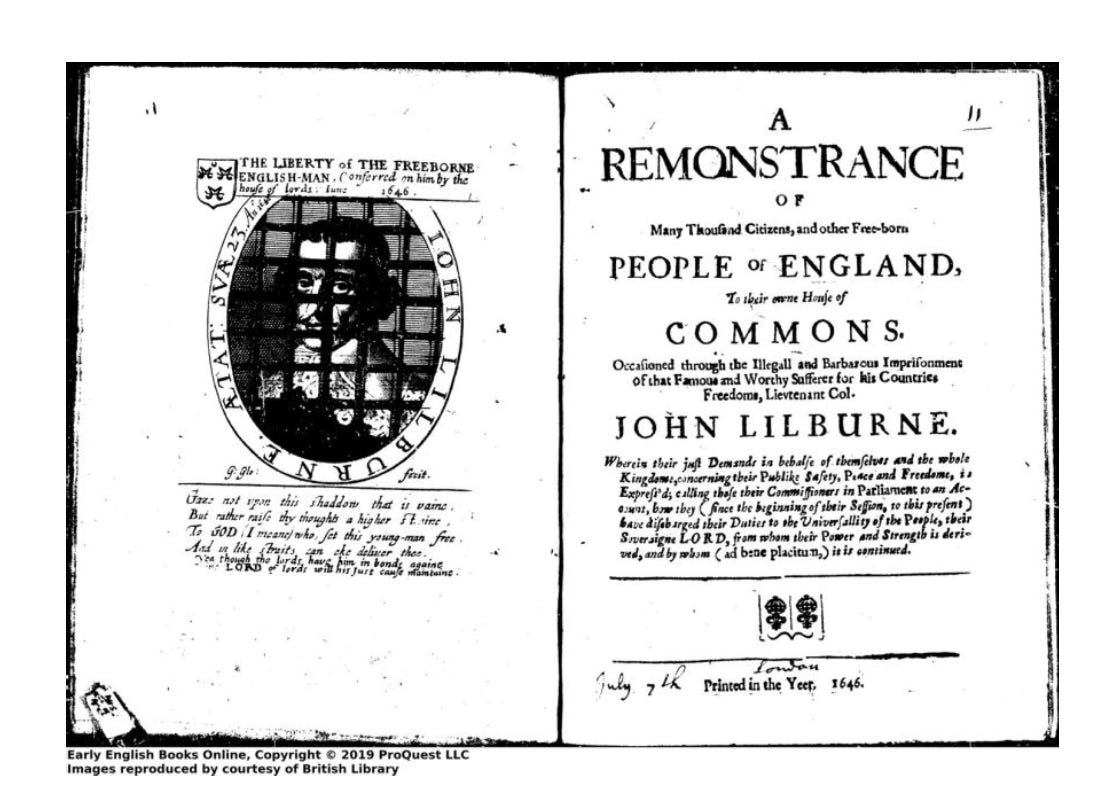
I have attached an image of the Leveller leader John Lilburne from a pamphlet entitled A Remonstrance of Many Thousand Citizens (1646). John Foxe’s Acts and Monuments contains images of several of the prison writers I discuss in the book, for example, John Philpot imprisoned in a coal cellar.
The letter from prison is “resistance literature” directed against a religious and political regime. The letter from prison is “a dialogue” between a prisoner of conscience and the communities that support the prisoner’s struggle.
Notes & Sketches
I begin every book cover design inside my notebook. It’s important to note that for me, this stage begins with what is essentially a brain dump. There are a lot of bad ideas and basic connections that simply must come out of my head in order to make progress.
Here a little video of my notebook pages for The Letter from Prison.
Digital Sketches
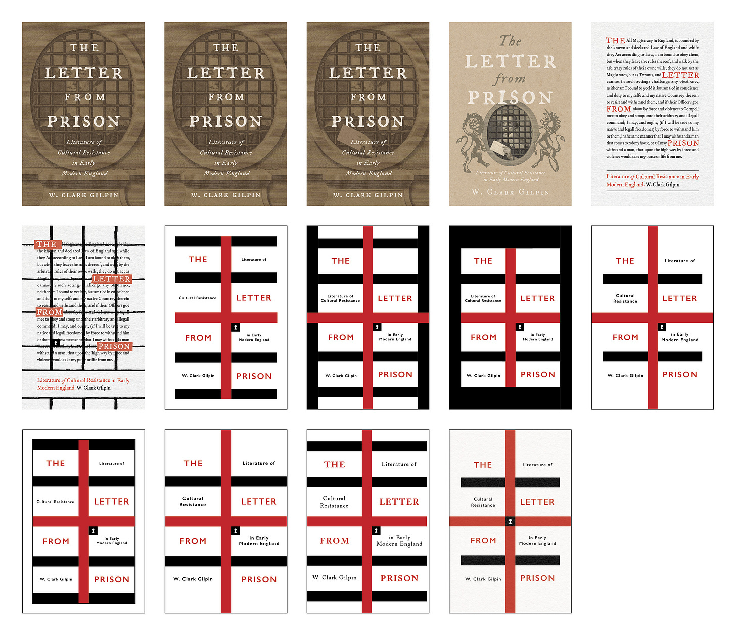
After marking up a few pages inside my notebook, my process usually involves the creation of several digital sketches in Photoshop. I’m not worried about perfection yet—this part of the process is about getting ideas and sketches from my notebook in and pursuing any new ideas I have in the process, and quickly. This usually results in a “sketches” folder with 20–30 covers of varying degrees of quality and completion. There are always stinkers.
My ideas for this cover were fairly developed on paper, so there was a little less exploration and iteration than there is for some others. Here’s what I “sketched” for The Letter from Prison:
What I did here with the English flag versions is a little closer to what I usually do with every idea: Iterate, iterate, iterate.
Round One
Once I have enough sketches that don’t make me hate myself, I choose a number of them to constitute my round one presentation to the client. The number varies depending on what I was asked for and how many fiddly little iterations of an idea I can’t seem to let go of.
Here’s a look at the what I sent for round one.
Revisions
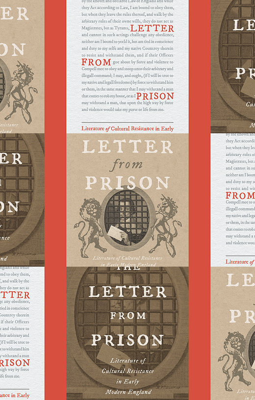
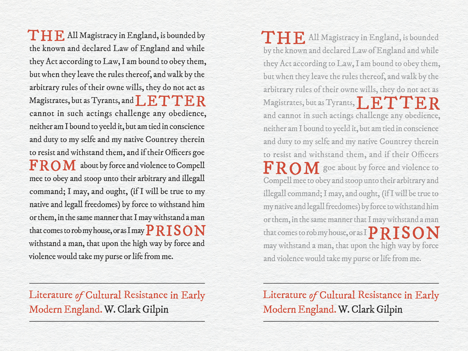
Somewhat surprisingly, the press chose the unconventional Composition 3!2 We made a few revisions turning the black text gray and making the title text bigger.
Final Cover
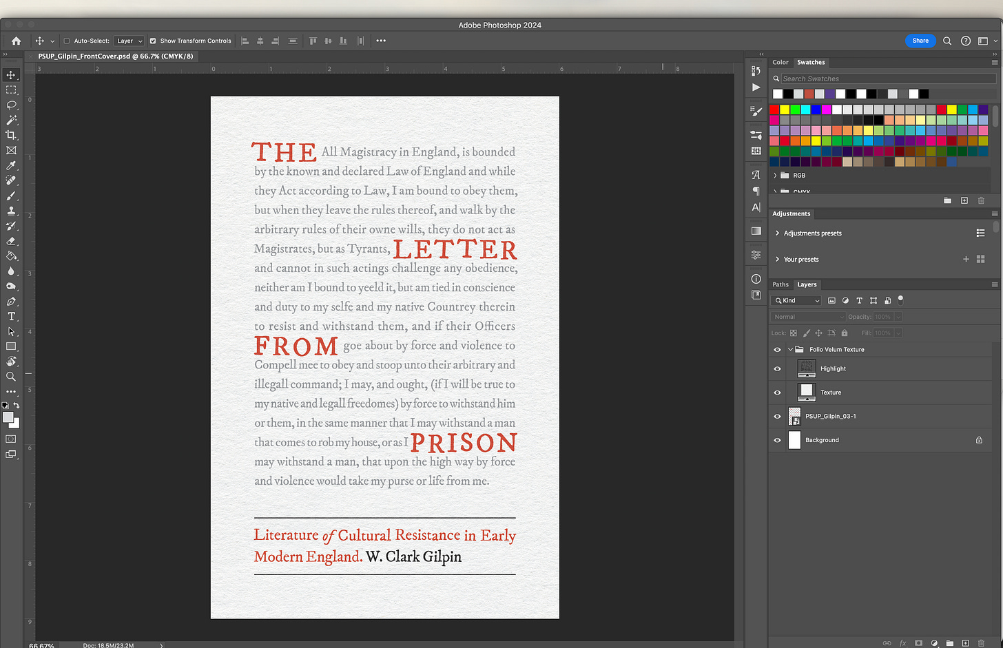
Here’s what my Photoshop layer situation looks like for the final cover. It’s ridiculously simple. I set the type for this unusual cover in InDesign—because setting this much type in Photoshop would be torture—and then exported it as a .png and applied my Folio Vellum Texture from True Grit Texture Supply’s Infinite Pulp pack.
Mechanical
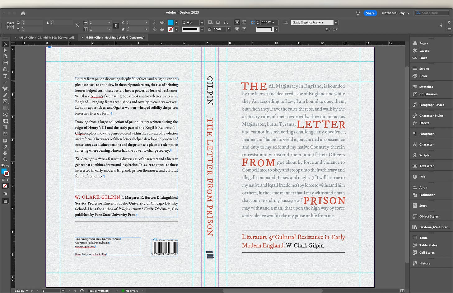
Here’s a look at the full cover, or if you prefer industry jargon, the mechanical. The mechanical comes months after the front cover is locked and is the last thing to do before sending the files to print.
That’s my cover and its process for The Letter from Prison by W. Clark Gilpin.
If you want to see more of these, consider becoming a paying subscriber. In addition to How to Design a Book Cover, you’ll get access to exclusive chat thread with myself and a growing community of book design lovers.
If that’s not possible right now, have no fear—this series is just a cherry on top for those who want it. Free subscribers will still receive the regular weekly dose of thoughtful waffling about book design, publishing tips, and notes on creative practice you know and (hopefully) love.
Thanks for reading and subscribing! I hope you found this interesting.
Until next time,
—Nathaniel
Colophon
A Book Designer’s Notebook is a newsletter about book design and creative practice for writers, designers, and book lovers.
It uses the typefaces Merriweather, Futura, and whatever fonts Substack has chosen. Merriweather is a Google font designed to be a text face that is pleasant to read on screens. Futura is geometric sans-serif designed by Paul Renner in 1927. It is on the moon.
Nathaniel Roy is a book designer, collage maker, photo taker, self publisher, and a few other things in Ypsilanti, Michigan.
You can see his work and hire him here. If you want to support this newsletter, you can buy him a coffee here.
Free subscribers will still receive their weekly post with no paywall!
To quote my mother: “That’s the front cover?!”






The letter peaking out from between the bars. So cheeky. I love it.
*chews on this for a while* I mean, yeah, it's a pretty straightforward process, but the evolution of the design is fascinating. Especially looking at the original notebook sketches to the final compositions, it's easy to track the follow through and improvement of ideas. It makes me feel a little better about my initial designs for things, because I guess the message here is "we all gotta start somewhere!"
The final design is fantastic, and I can see why they chose it, because it really stands out against the more conventional designs.