


How Jazmin Welch Designs A Book Cover
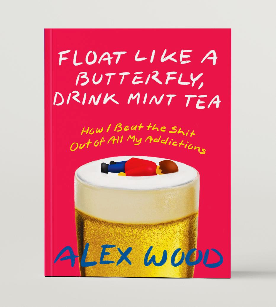
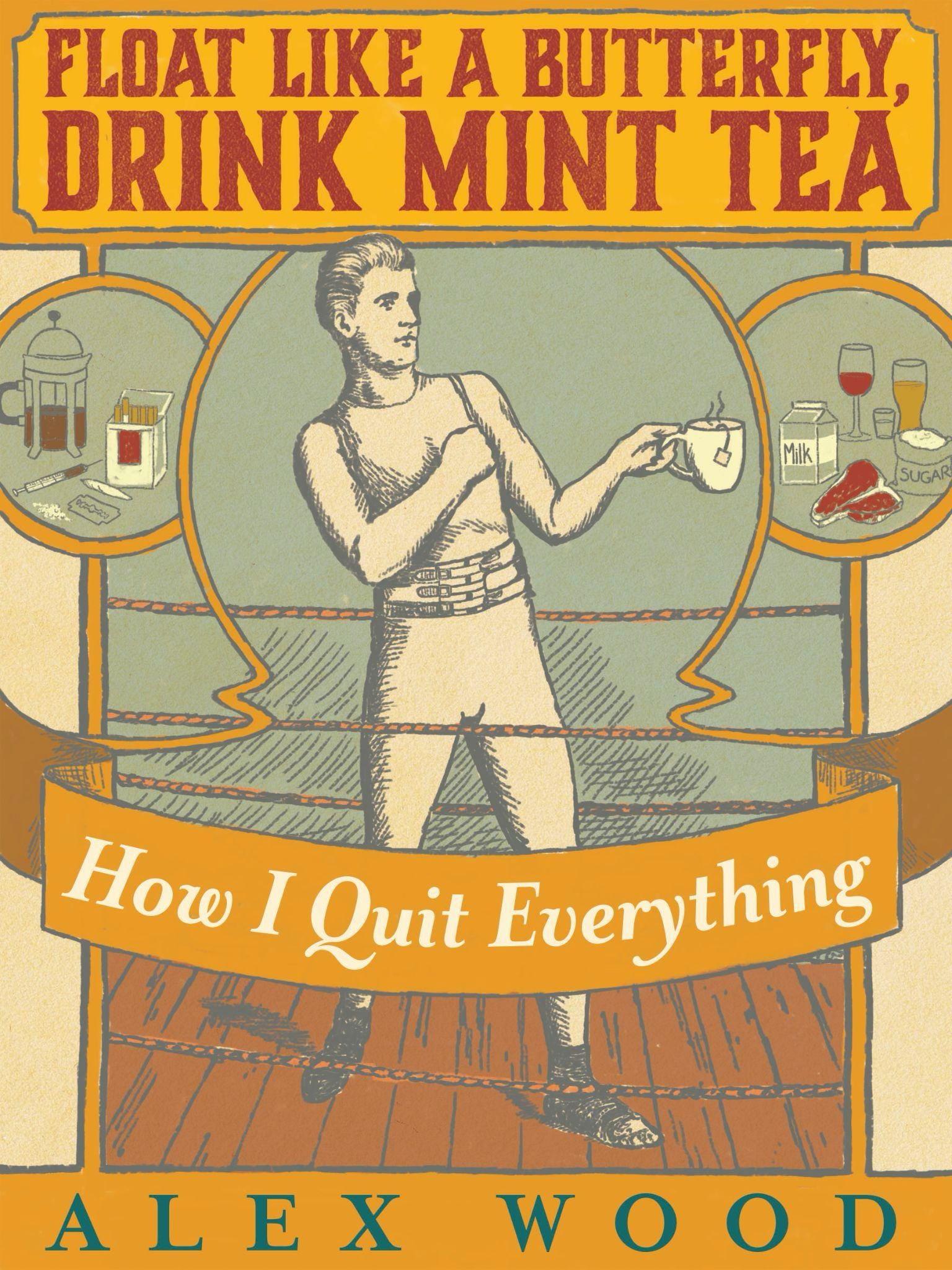
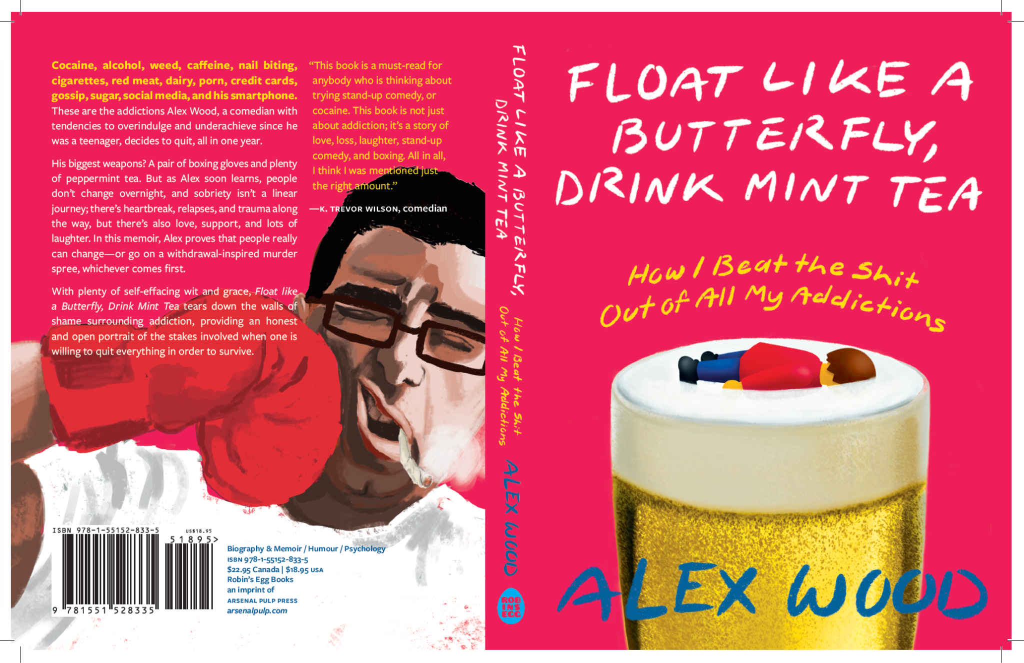
Float Like a Butterfly, Drink Mint Tea by Alex Wood


Hello there.
This week’s How to Design A Book Cover is a guest post by the inimitable Jazmin Welch! Jazmin Welch is a wonderful person, book designer, and owner of Fleck Creative Studio. Today, she is sharing the design process for her cover of Float Like a Butterfly, Drink Mint Tea by Alex Wood.
This is a free, guest post edition of How to Design A Book Cover. If you’d like to receive more like this in your inbox every other week and access the entire archive of posts about how I design my book covers, consider becoming a paid subscriber. Thanks!


Here’s Jazmin:
This book design is from the Spring 2021 Season at Arsenal Pulp Press. I had a lot of fun with this one, and the process was anything but linear, so I thought it would be a fun one to share. Many of these sketches have never seen the light of day!
The Brief
I designed this book before I decided we needed to introduce briefs at Arsenal Pulp Press. They are critical for aligning on the desired tone and overall look of the book. Before we used briefs, I would verbally align on things through meetings with both the team and the author. In these meetings, I ask many questions about the book to determine how the book should come across to readers and media and I would compile my own brief. (Since this time I am happy to note that we now use a slightly more formalized briefing form, ensuring we’re all starting on the same page.)
Needless to say, here’s the book description for Float Like a Butterfly, Drink Mint Tea:
A wildly disarming memoir by comedian Alex Wood on how he overcame his multiple addictions.
As an alcoholic, drug-addicted comedian with tendencies to over-indulge and under-achieve since he was a teenager, Alex Wood was on track for to achieve his greatest goals: to die young and drunk. At the age of twenty-eight, feeling desperate in the face of addiction and associated health problems (ulcers, pancreatitis) - which were compounded by the deaths of loved ones and even worse undiagnosed issues - he decided to do something he'd actually been doing all his life: fight.
Alex concocted a plan to quit not only alcohol and drugs, but everything else that he felt was holding him back: cigarettes, caffeine, red meat, dairy, sugar, social media, smartphones, porn, credit cards, nail-biting, social media, and gossip. His biggest weapons? A pair of boxing gloves and plenty of peppermint tea. But as Alex soon learned, people don't change overnight, and sobriety isn't a linear journey; there's heartbreak, relapses, and abuse along the way, but there's also love, support, and lots of laughter. In this memoir, Alex wants to prove that people really can change, or go on a withdrawal-inspired murder spree, whichever comes first.
With plenty of self-effacing wit and grace, Float like a Butterfly, Drink Mint Tea tears down the walls of shame surrounding addiction, providing an honest and open portrait of the stakes involved when one is willing to quit everything in order to survive.
You can tell, I had a lot to work with! The book itself is such a great read, and as the description implies, is so much more than how one man quit his addictions. While there is love, loss and layers of heartache and meaning, this book is also extremely funny. We wanted to ensure the cover could balance all of these things; to not feel too light and definitely not too heavy. This book doesn’t give you all the answers about how to overcome addiction. It’s an honest glimpse into the messy struggle to claim a life back…All with a throughline of humor.
After reading the manuscript, I met with the author to chat about what ideas he had for the cover. We planned to bring in the element of boxing given that the title is a play on Muhammad Ali’s famous quote, “Float Like a Butterfly, Sting Like a Bee.” We also aimed to try a few ideas that alluded to the various addictions mentioned in the book. Let the brainstorming begin!
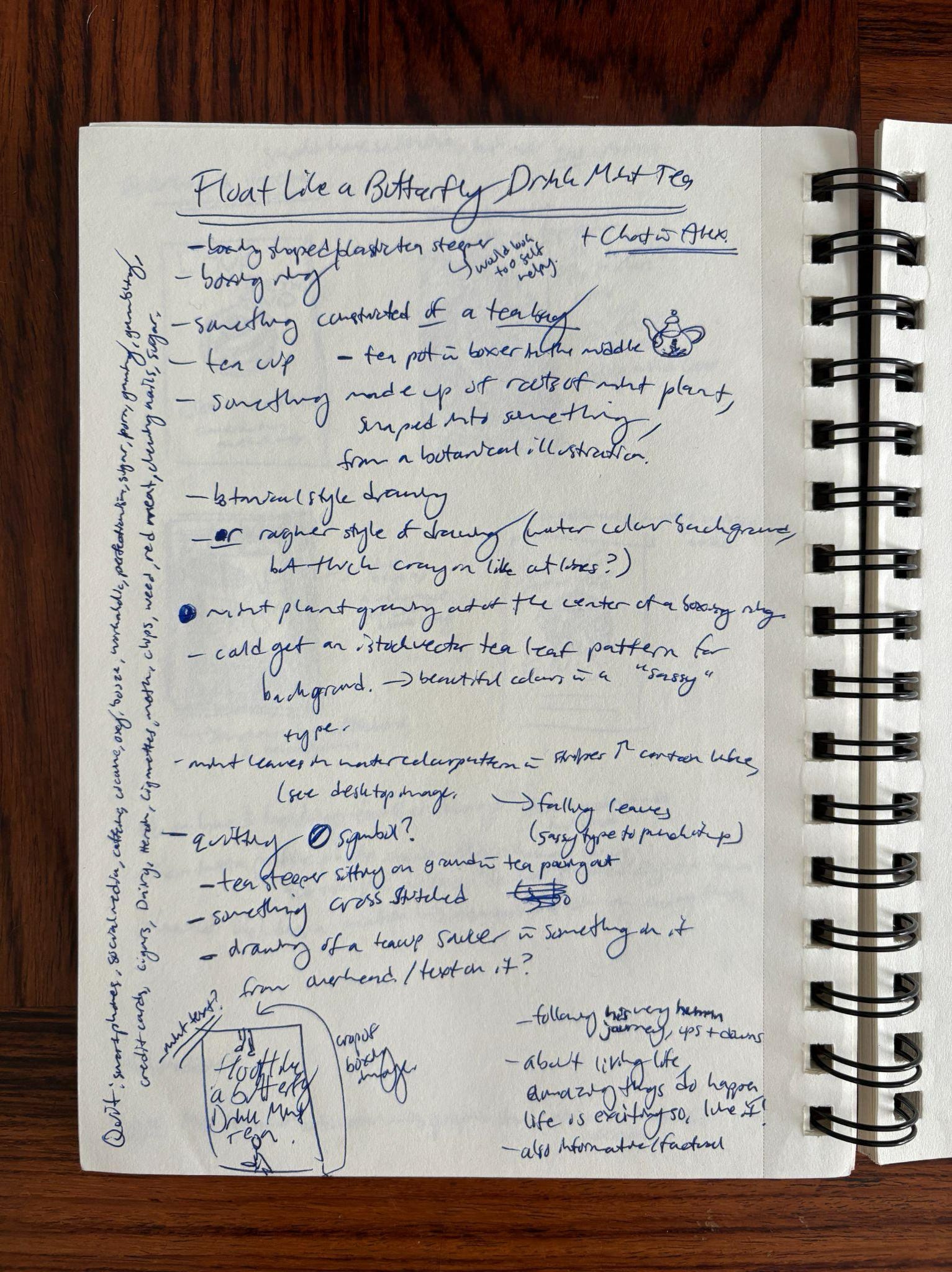
Notes & Sketches
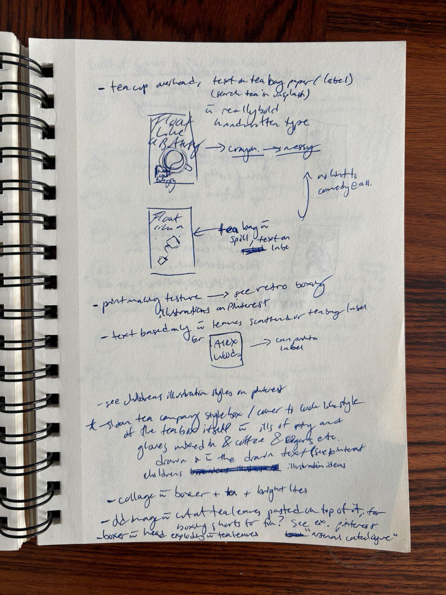
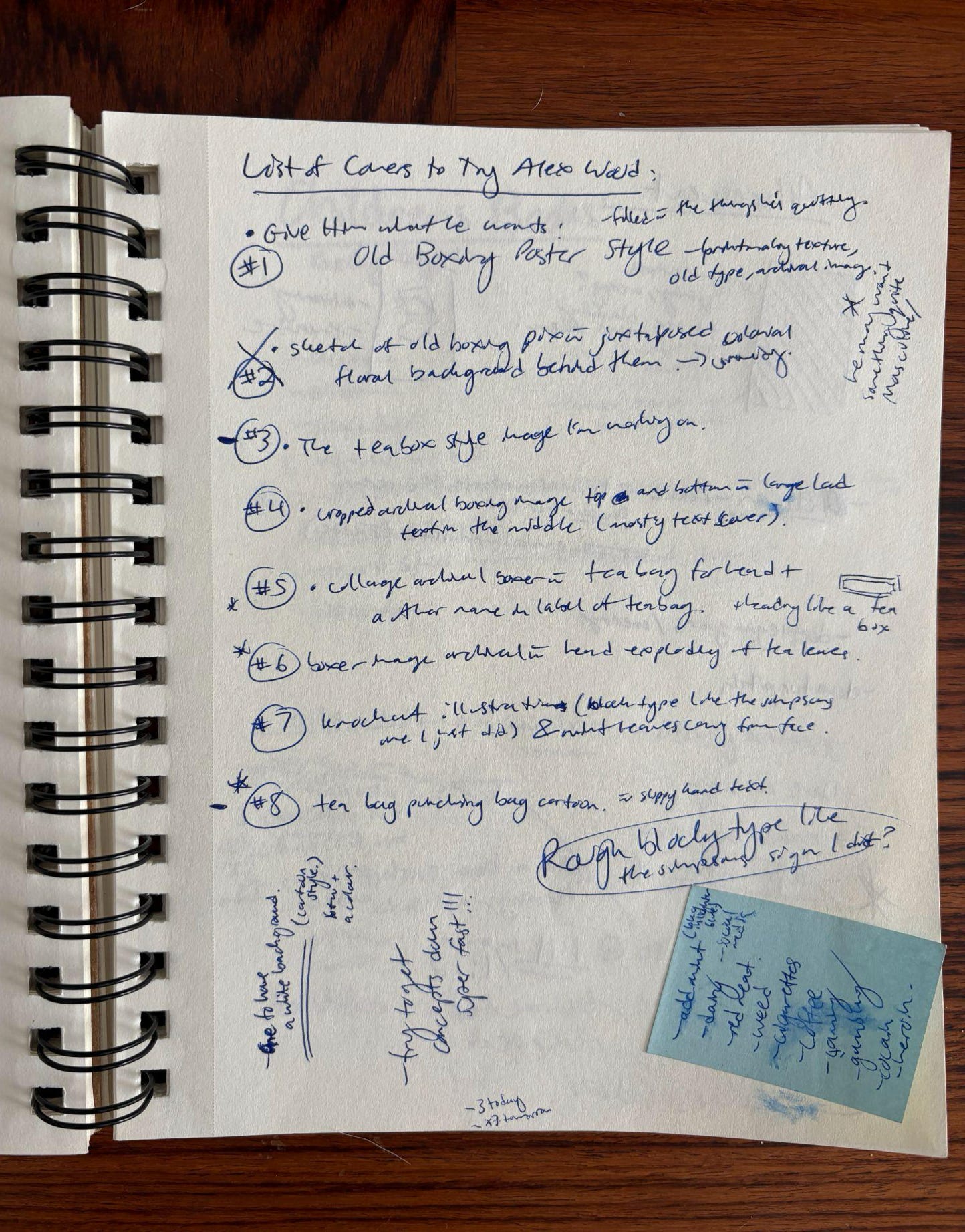
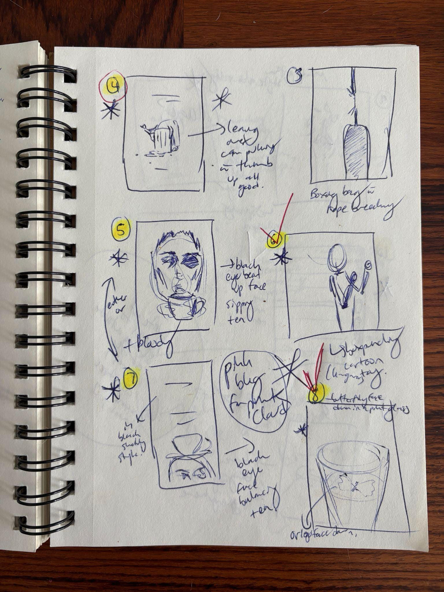
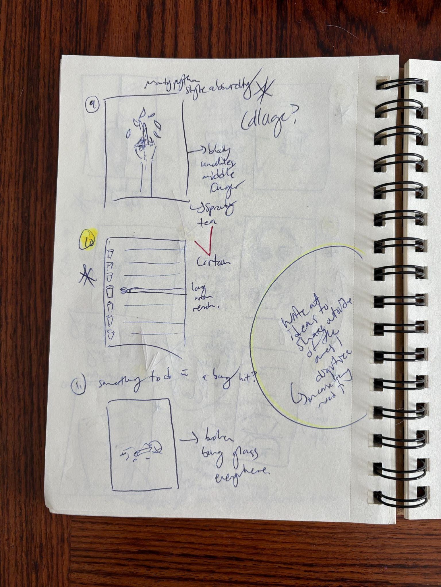
Here are some of my early notes and VERY messy sketches that only I could understand. Sometimes I write out the ideas; I create a list and mull them over to determine which ones will warrant trying a digital rendering. I will workshop the ideas that the author and publisher are excited about, but I’ll keep brainstorming other ideas that may have come up during my reading or thinking about the book. I keep writing things down, drawing thumbnails, and researching images until I’ve got a good number of ideas that I’m personally really fired up about.
Digital Sketches
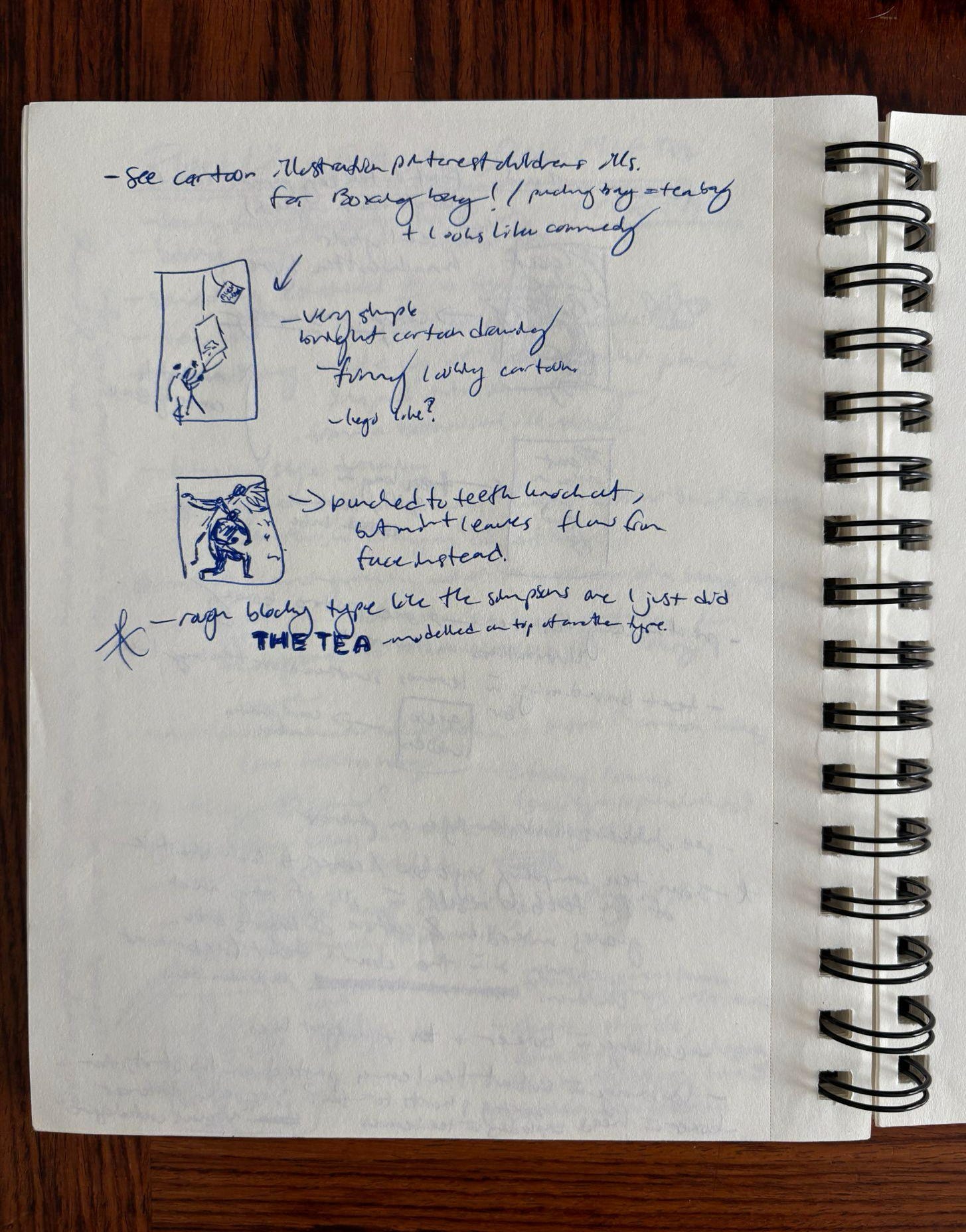
After determining which ideas I think can work, I open up my computer and begin to digitally render them. They’re still rough at this point, but I try to get ideas down and mostly fleshed out so that I can consider them conceptually solid. Once I’ve got a number of these digital sketches done, I keep refining them until I can then consider them good design. The top pics are then shared with the team. In take 1, I tried out various ways of representing all the various addictions, as well as playing with the boxing metaphor. I found some really great archival boxing imagery to play with.
These concepts included:
A small cartoon man punching a giant tea bag as if it’s punching bag
2 boxers in a match, one is punched in the face and rather than a spill of blood from the blow, a swirl of mint leaves emerge
A cover made up entirely of a tea box, where some of the addictions are rendered as ornate decorative details on the box
An old style boxing poster with some of the addictions represented as if they are the other opponents in the match
A pattern of iconography of the addictions which includes a poker chip, a bottle of booze, a cigarette, red meat, dairy, a joint, and a syringe
A boxing match overlaid with a green tone with the title in large lettering, taking up most of the cover
A boxer in the center of the cover with his head completely covered in mint leaves that interact with the title
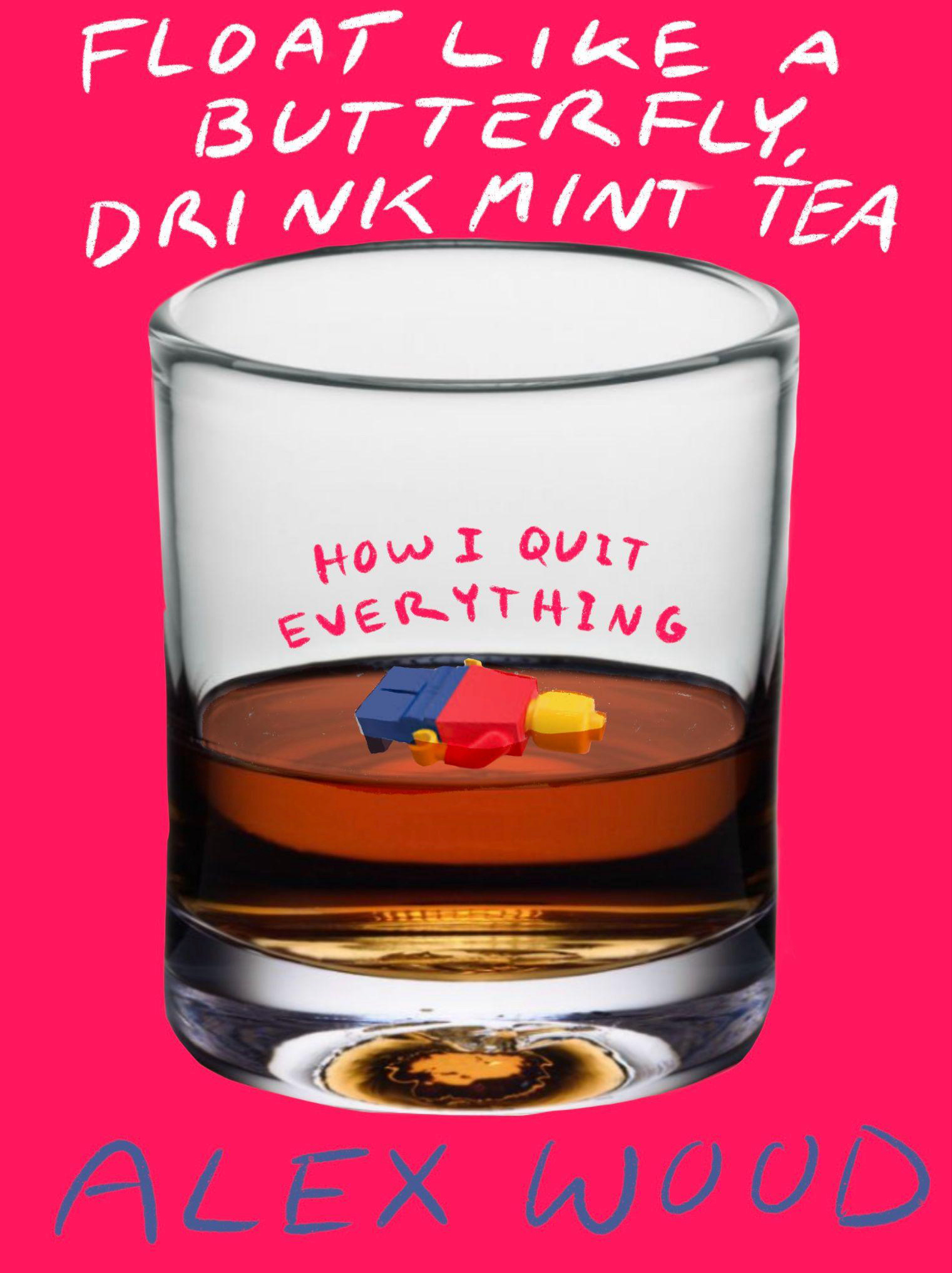
Take 1:
Here’s what I presented in round 1:
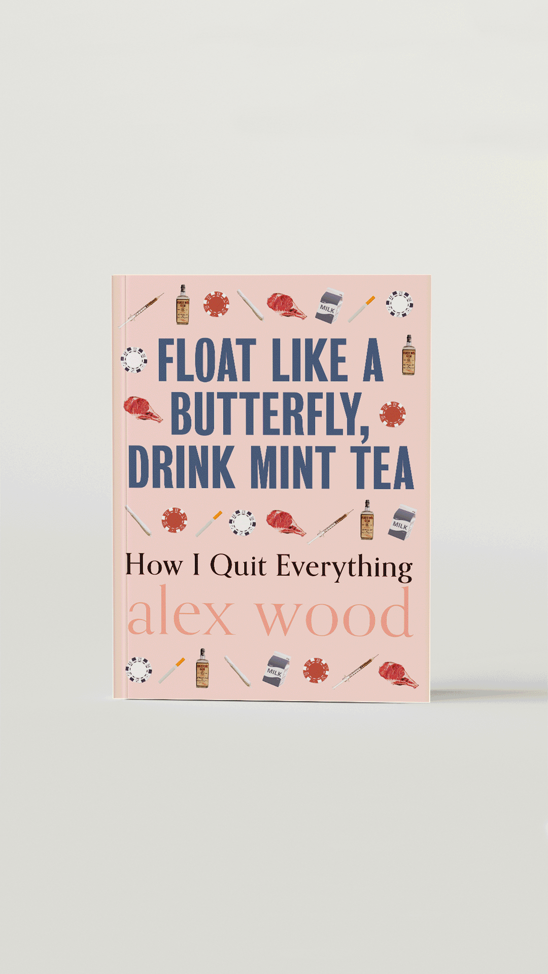
We landed on this one as the final cover:
But this story doesn’t end here…This cover was tough.
Usually when a cover is presented to sales reps or buyers, they have their own opinions about how the cover should look in order for it to be sold. Publishers don’t have to listen to those folks but when they are responsible for ordering books in large quantities for their stores, publishers can be swayed to change a cover if someone in sales is really keen on the book, but not liking the cover direction. That was the case for this cover. We reconvened and took a new approach, aiming for something a bit more bold and a bit more funny! Focusing on the addictions in take 1 wasn’t capturing the emotion and complexities present in the book.
Take 2:
Back to the drawing board I go! And I mean that literally.
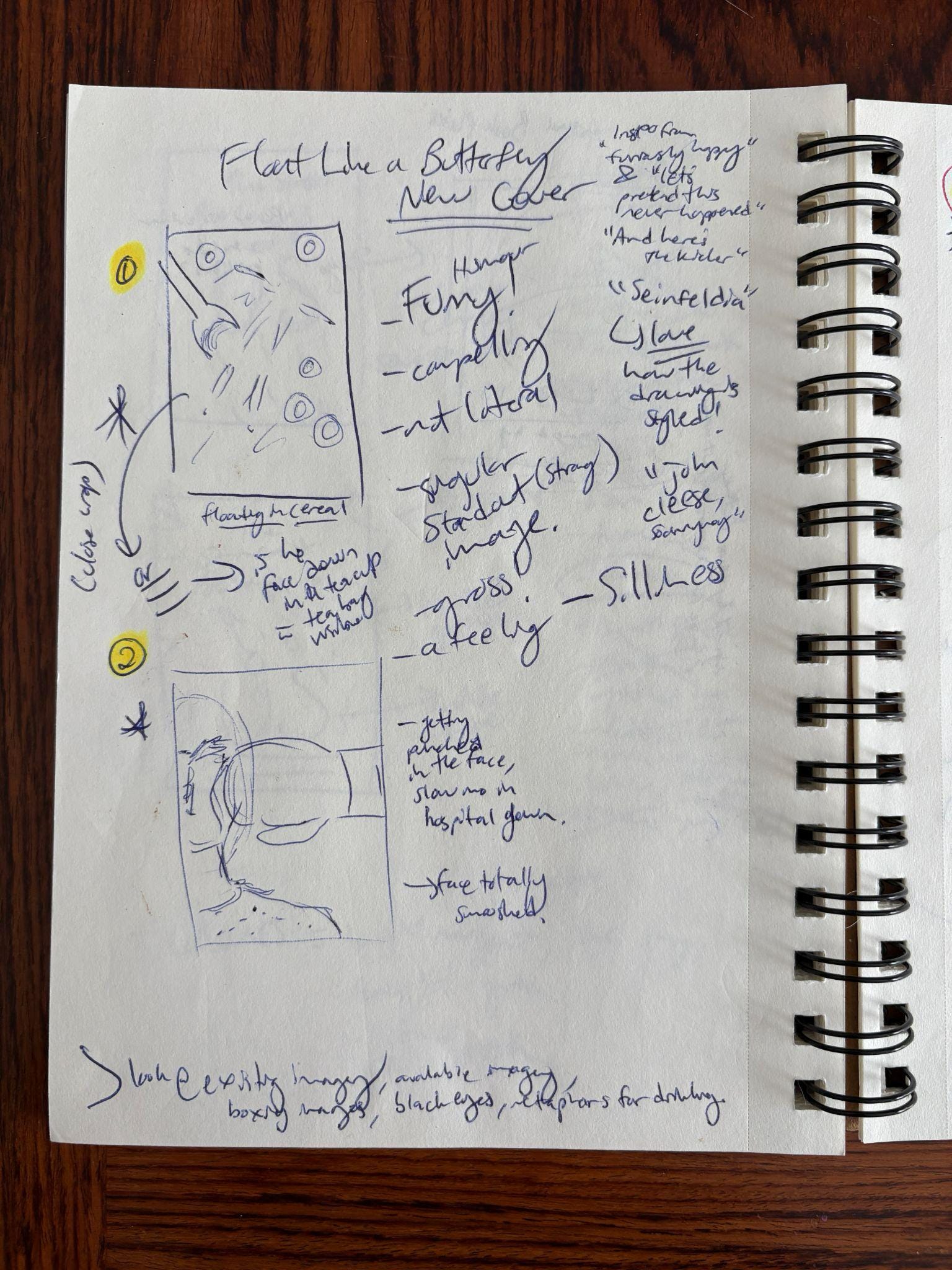
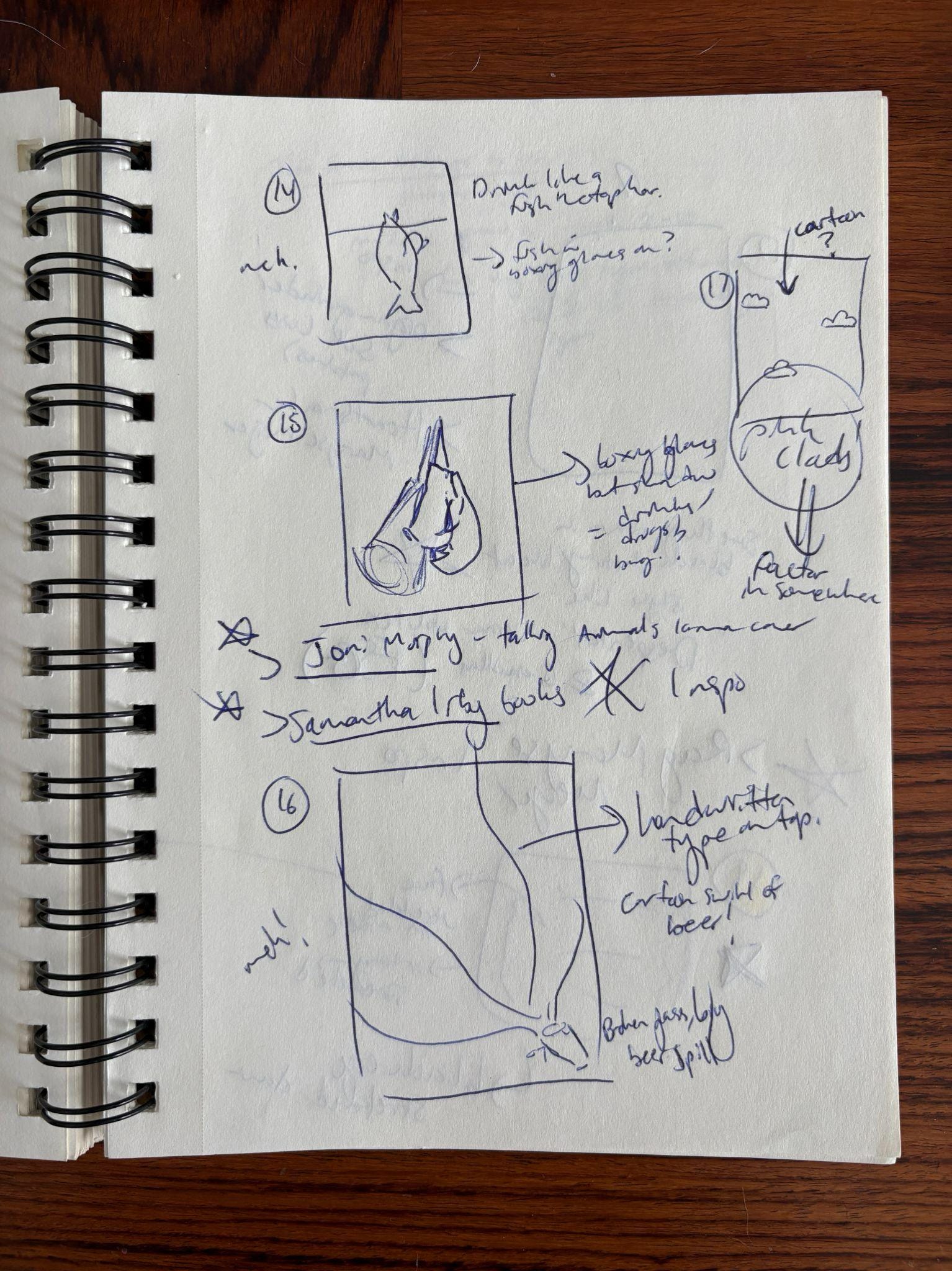
Here are some new concepts that I presented in take 2. These are very rough since by the time the team meets with the sales team, the covers need to be ready for garnering early interest and media attention. I was rapid fire drawing and throwing on type placements on my ipad to see if anything would stick.
These new concepts included:
A man (Alex) punching himself out with a joint in his mouth (I then tried this in a few color ways and drawing styles)
A man with his head in a garbage can, one arm raised to give a thumbs up. Upon reading the book, readers will discover the scene in which Alex pukes in a garbage can at a low moment
A man trapped under a giant beer glass
A close up of a man with bruised eyes from getting punched out and a fancy teacup and saucer on his head
A similar drawing of a beaten up man, but he’s drinking from a teacup
A man floating face down in a teacup
Two punching Kangaroo pen toys combatting each other
Rows of long arms reaching out for a beer, showing repetition of reaching for the addiction over and over
A LEGO man face down in a glass of whiskey
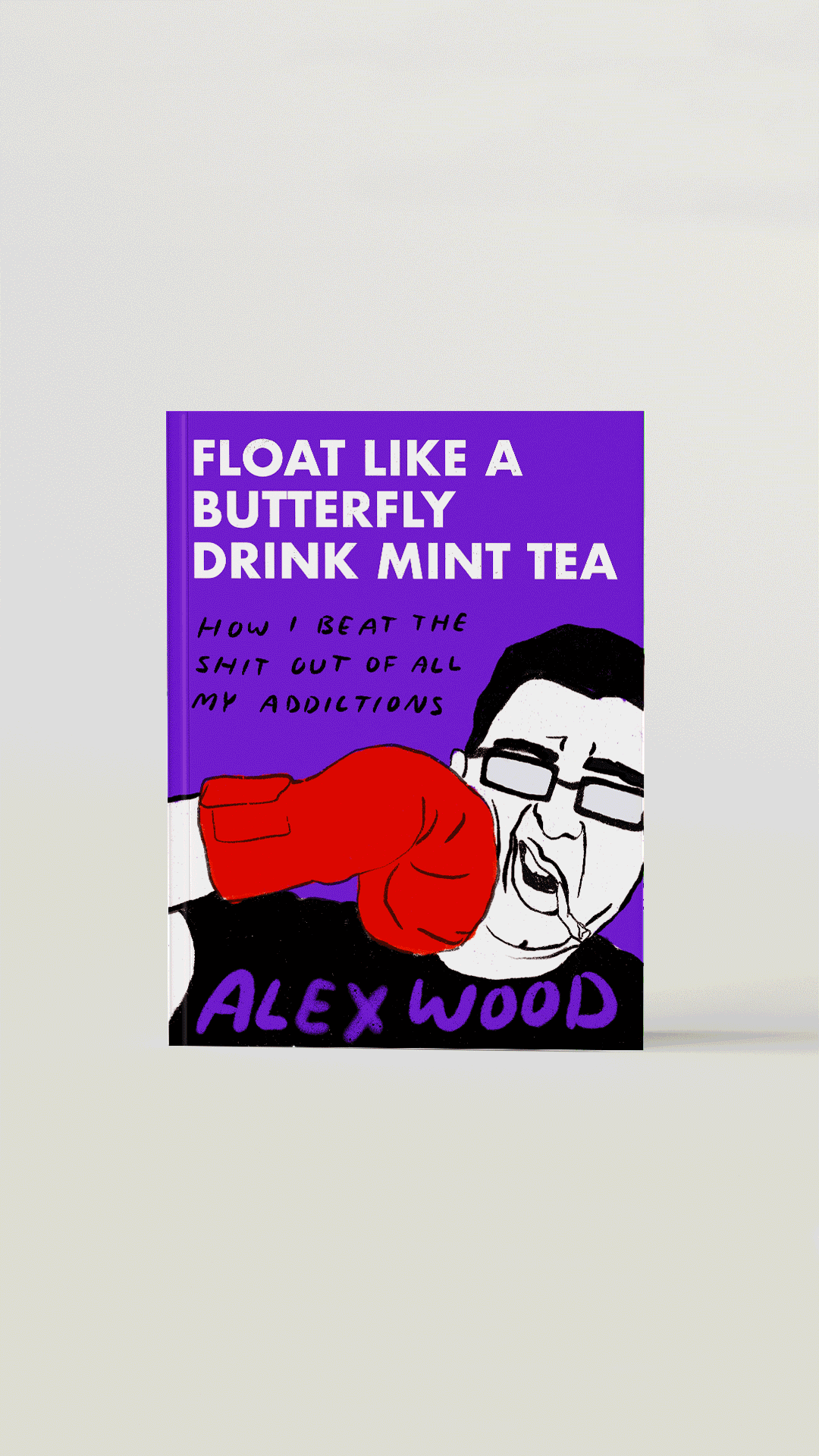
During this new phase of concepting, I landed on the below idea of a LEGO figure floating face down in a drink. This idea was approved by the author and the publisher so then it was time to refine it and make it happen! I was really hoping to bring this idea to life by photographing the scene, but first I had to see if there were any issues with using a LEGO figure on a book cover. After some emails back and forth with LEGO, it was a no go. Given the copyright and looming time constraints, I decided to draw the final cover so that I could ensure the toy was reminiscent of a LEGO or Playmobile toy, but not the real thing. I also changed the whiskey drink to beer to lighten the tone of the cover and allow for more obvious buoyancy in the foam.
I love how the sense of defeat with the face down figure is balanced by a lightness due to the fact that the figure is a small toy that is very buoyant in the beer. This mirrors the book in its raw discussion of personal addiction and heartache which is simultaneously balanced by an incredible sense of humor.
The overall tone of the cover is enhanced by the bright pink background and casual hand lettering.
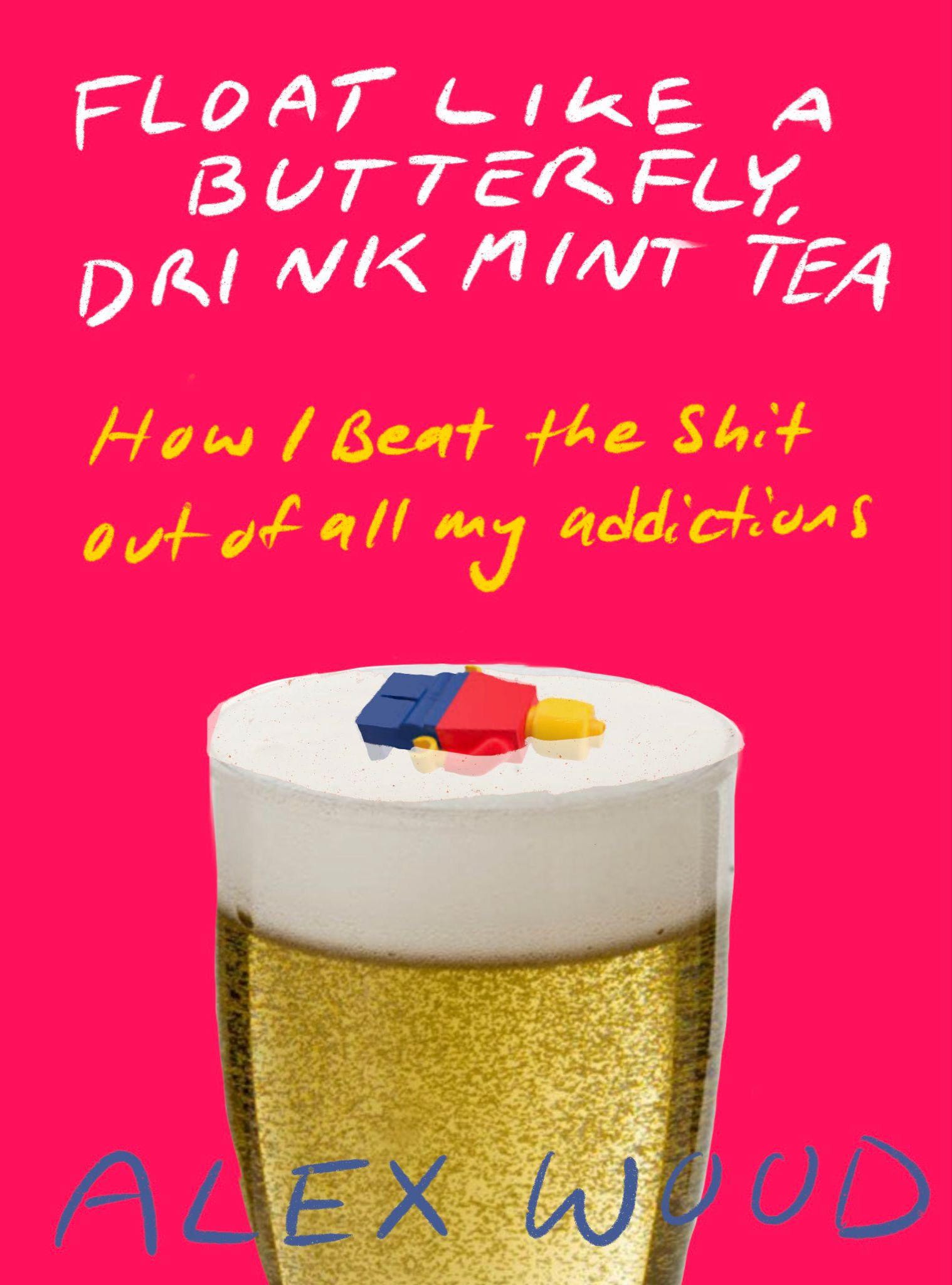
I rarely get to do hand lettering and I don’t think it’s a strength of mine, but I wanted to push myself here. Since this cover is meant to be humorous, I felt that a more messy handwritten font would be a nice fit. I can’t tell you how many times I wrote this text over and over and over again until I was satisfied with it. It’s also an extremely long title that has an even longer subtitle, making the type all the more grueling!!!
The final cover:
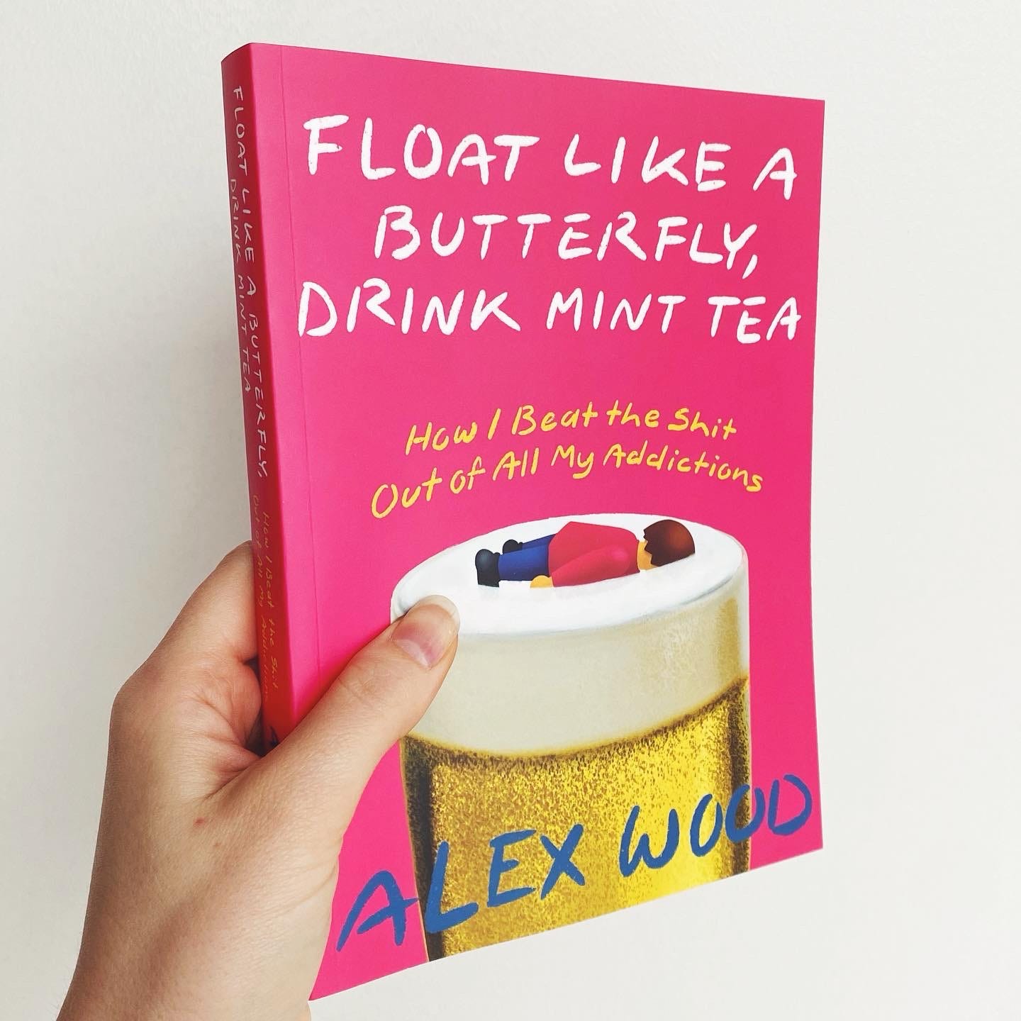
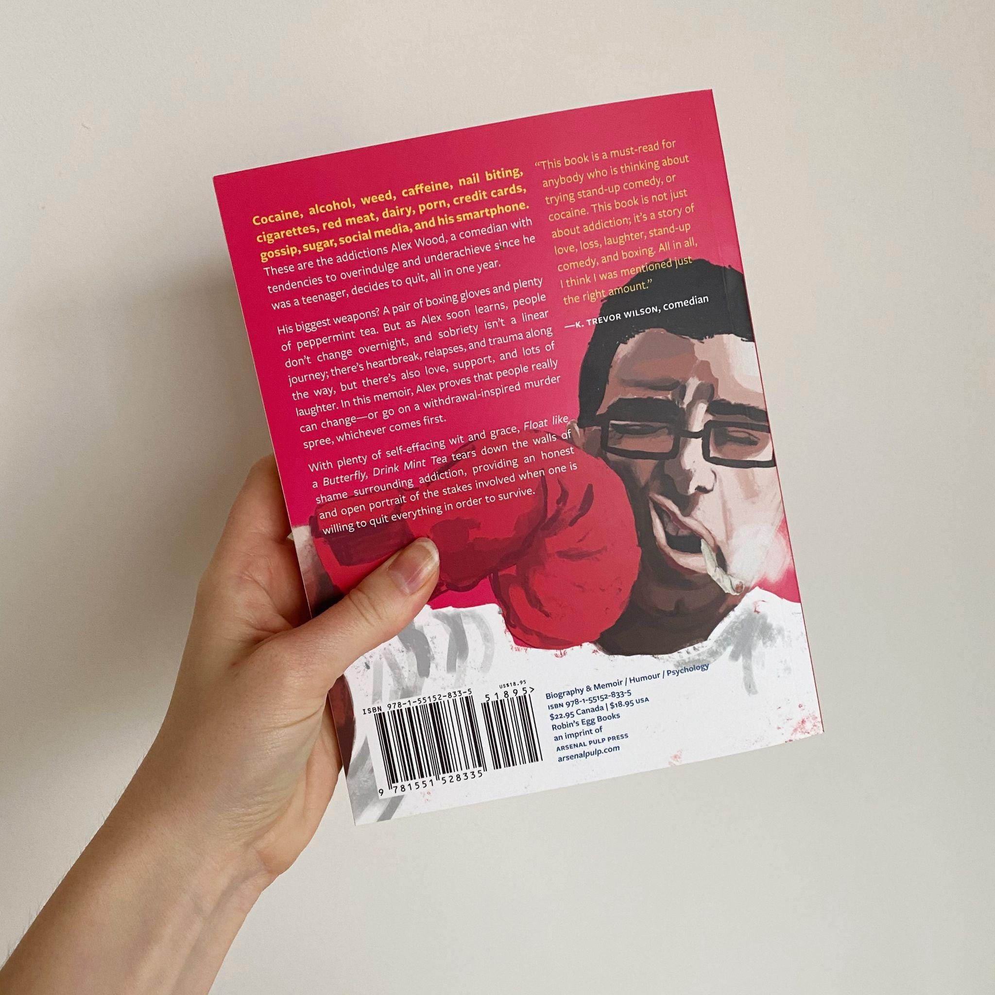
I am genuinely happy with where this cover landed and prefer this final option to the first take! It was a long journey but as is often the case with this kind of work, I look back on all the options and fun things I got to explore with fondness. I got to play and collaborate, and I never feel that these rough sketches go to waste. And… sometimes a killed concept just might make its way onto the back cover!
If you’re interested, you can buy the book here and check out Alex’s podcast Alex Wood Quits Everything here.
Thanks for Reading
Thanks for reading! And thanks to Jazmin Welch for sharing her process. I love having talented friends and getting to share those talents with my readers.
If you’d like to hear more from Jazmin, last year she and I had a nice long chat about book design that you can read here and here.


If you’d like to hire Jazmin for your next project, you can connect with her via this form on her website.
Excellent work here! Made me want to read the book.
I love the inventiveness and lateral thinking involved here, thank you ( and Jazmine) for sharing this😊