asked me if I’d write a guest post about the many, many book covers of The Dispossessed by Ursula K. Le Guin throughout its publication history, and I was more than happy to oblige. Enjoy!
“Can 2025 be the year book covers become good again?”
I sigh. It isn’t the first time I’ve encountered this sentiment. My first thought—uncharitable, probably—is “do you even read?”1 I see opinions like this crop up here from time to time. I don’t really get it.
I don’t mean offense, but if you ask this about book covers, I am inclined to believe you either have contrarian tastes, don’t go to bookstores, or willfully ignore the vast majority of books published today. There are far too many books and far too many covers—and good ones—to take such a comment seriously. It’s too broad.
I posted something along these lines. And my favorite book design disagreer,
, chimed in. I genuinely love when Chris disagrees with me. I respect his opinions and they always sharpen my own thoughts.
Sorry, Nathaniel but I agree with the writer, and not because I’m contrarian or don’t go to bookstores. I have a Ph.D in English, and I’ve lived around books for 50 years. If I want an old book, I will always go to ebay to buy an old copy. Never a new one. Why? The covers.
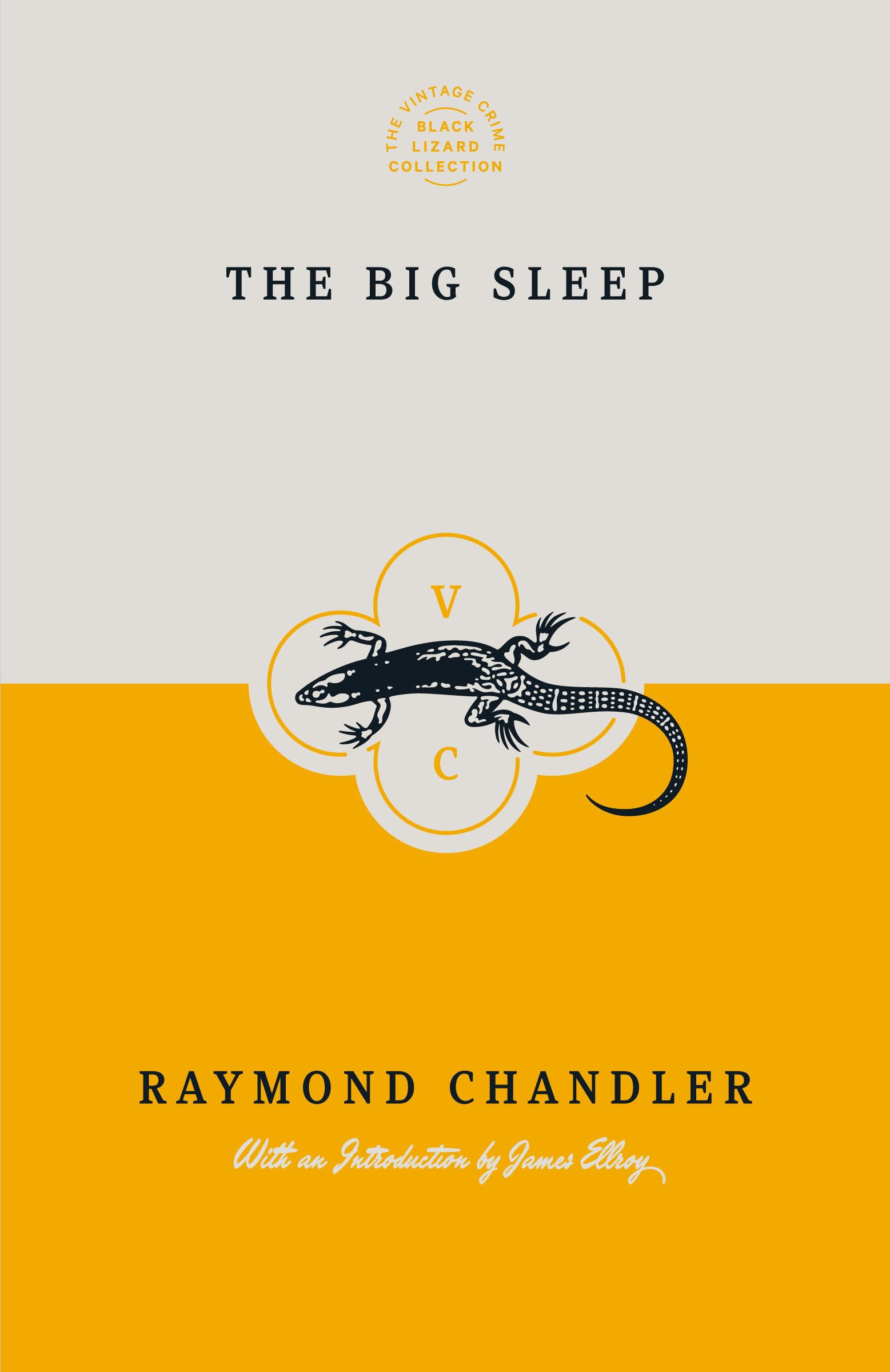
Last year I wanted to read The Big Sleep by Raymond Chandler. This was the cover at Barnes and Noble.
, the original writer of that quote above, are making. I do! Here’s what I replied to Chris:
That is a bummer of a cover. It has that early-digital-design-tool stink on it.
You probably walked by several good covers on the way to that bad Chandler cover. Though in your view maybe not as many as I think, because I know you gravitate toward more illustrative, decorative covers that aren’t so “designy.” But my original point was that there are just too many publishers and designers doing good stuff to make such a blanket statement.
That cover you bought is cool, but that style of pulpy illustration was as trendy back in the day as our oft-decried contemporary trends. Covers like that sometimes prioritized selling over accuracy or interpretation. I wonder, how does it represent the book? I haven’t read it.
That cover you don’t like was designed in 1988. According to this listicle, there have been a handful of new editions since then that, I at least, think are better.
Maybe these still aren’t your cup of tea. But they’re not “bad,” at least in my (professional) opinion. And what different approaches we have here!
People like to drone on about how design is objective and art is subjective and blah blah blah, but book covers—especially fiction covers—sit in that liminal space between the two disciplines. “Good” is determined by individual tastes as much as it is by design principles and quality of brush stroke.
Want more from A Book Designer’s Notebook? Every other Wednesday, paid subscribers receive How to Design a Book Cover, a series breaking down the cover design process from sketch to final cover.
Curious, and wanting to write more about this, I asked Michael what he thought was a “bad” cover, and what he thought was the platonic ideal of a “good” cover.2
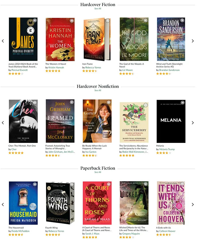
If only I had a photograph of my local bookstore's new fiction section, haha. So I screenshot the NYT bestseller list on B&N, and there isn’t a solid book cover on the entire thing. If there’s a book that has any hope, it’s the first one. Every one, including the black one with the white lettering, is trying too hard. They “lure” you in with vibrant colors and a complicated mess of what they consider design. Unfortunately, I believe none of it works and has the opposite effect. They say to “never judge a book by its cover,” but I do, constantly.
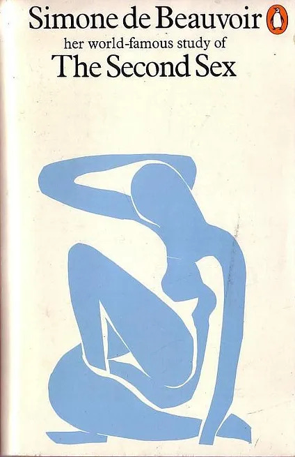
As for good covers… Penguin still does a decent job, especially with their classic literature and modern classics line. Here are some from a quick search I find beautiful. Up until the 40s, I feel like, overall, book covers were solid, elegant, and stunning. Then something changed in the 40s/50s and they became, largely comical. There was a resurgence of good covers in the late 60s and 70s and since then it has been largely flat. There are obvious exceptions and great covers still in existence, but they seem so rare.
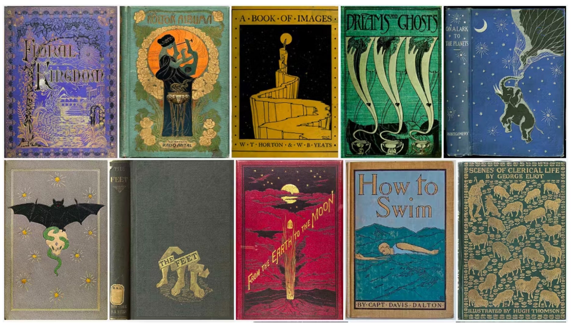
This link shows book covers from 1820 to 1914 and they are absolutely beautiful…
I’m with him, those are all good covers. I think all of the ones he shows here are lovely. I too love modernist cover designs. Does Chris, though? Maybe these two disagree on “good,” while agreeing contemporary covers are “bad.” Maybe not. Taste varies!
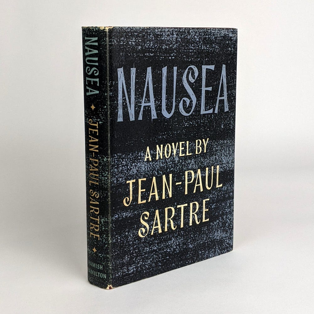
Context is always important. I agree, bestsellers don’t usually have the best design. But if Barnes & Noble’s website existed when Jean-Paul Sartre published Nausea, would it be on the home page?
The Nausea cover above is from 1982. Here’s the 1962 jacket:
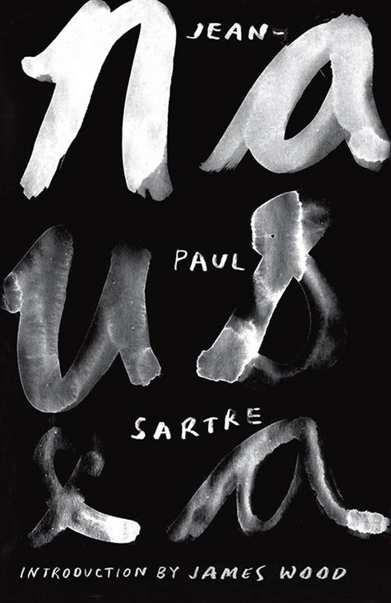
And here is a cover for Nausea published in 2013 by New Directions, the same publisher as the 1982 edition. New Directions is a publisher that consistently—again, in my opinion—puts out great design by some of the top book designers today.
Maybe you think this 2013 cover is bad. Or maybe just not as good. I think it’s great and gets at something conceptually similar to the ’80s New Directions paperback.
What I love about contemporary book design is the variety. I don’t know about you, but I want my bookshelf bursting with different styles, colors, shapes, and sizes.
Do you miss pulpy illustrations on covers? Let me direct you to Hard Case Crime. Mid-cenutry modern? Penguin Modern is, well, pretty damn modern.3
There are so many goddamn books published every day. There are massive conglomerates, smaller imprints owned by those conglomerates, non-profit independent presses, university presses, and more self-publishers now than ever before. There’s homogenization and crap being published, of course, both in covers and writing. I’m not arguing there isn’t. But there is a lot of good book cover design happening today. Look at anything from designers Na Kim or Tyler Comrie or Matt Dorfman or Jason Arias or independent presses like Graywolf or Belt or Two Dollar Radio or McNally Editions. I could go on!
Maybe I’m being obtuse. Chris and Michael’s argument is probably just that many contemporary, commercial books don’t have the best design and that backlist titles like The Big Sleep have outdated and bland covers floating around the marketplace. That is completely valid! Maybe I’m being nitpicky. I hope this doesn’t read like I’m picking a fight—I genuinely appreciate these opinions and I like learning about how people feel about book design. But I bristle at statements made about book design painted with an overly broad brush.4
There’s more to book covers than what’s on the bestseller list, and there always has been. You just need to look around a bit—or, if you like, you can ask your friendly neighborhood book designer. Hi there.
Whenever people complain about contemporary book covers, I know for a fact they haven’t looked at the cookbook section, because holy shit have those covers improved over the past 30 years 😅
I mean, pragmatically speaking, a 'good' book cover is a cover that did its job well and that doesn't necessarily equate to it being aesthetically pleasing in someone's subjective opinion. There are plenty of covers out there that are good covers for their genre, designed well, but just not my taste. That doesn't make them bad covers though. It just makes them not my cup of tea. I think a lot of people conflate what they like in cover design and what a cover's purpose is. There are also cover trends which come and go for every genre and, just like with fashion trends, some are better and more pleasing to look at than others.