A Book Designer's Gift Guide to Books about Book Design
AKA the Gift Guide That Nobody Asked For
Because I know this is what everyone wants for Christmas, I put together an extra special holiday gift guide exclusively for books about book design and typography. You’re welcome!
Links to bookshop.org in this newsletter earn me a small commission. This is a terrific way to support the newsletter while also buying some terrific books. Some of these books are currently out of stock, but I still recommend seeking them out elsewhere online.
These books are great for designers, authors, book lovers, and anyone who wants to know more about the art and craft of book design.
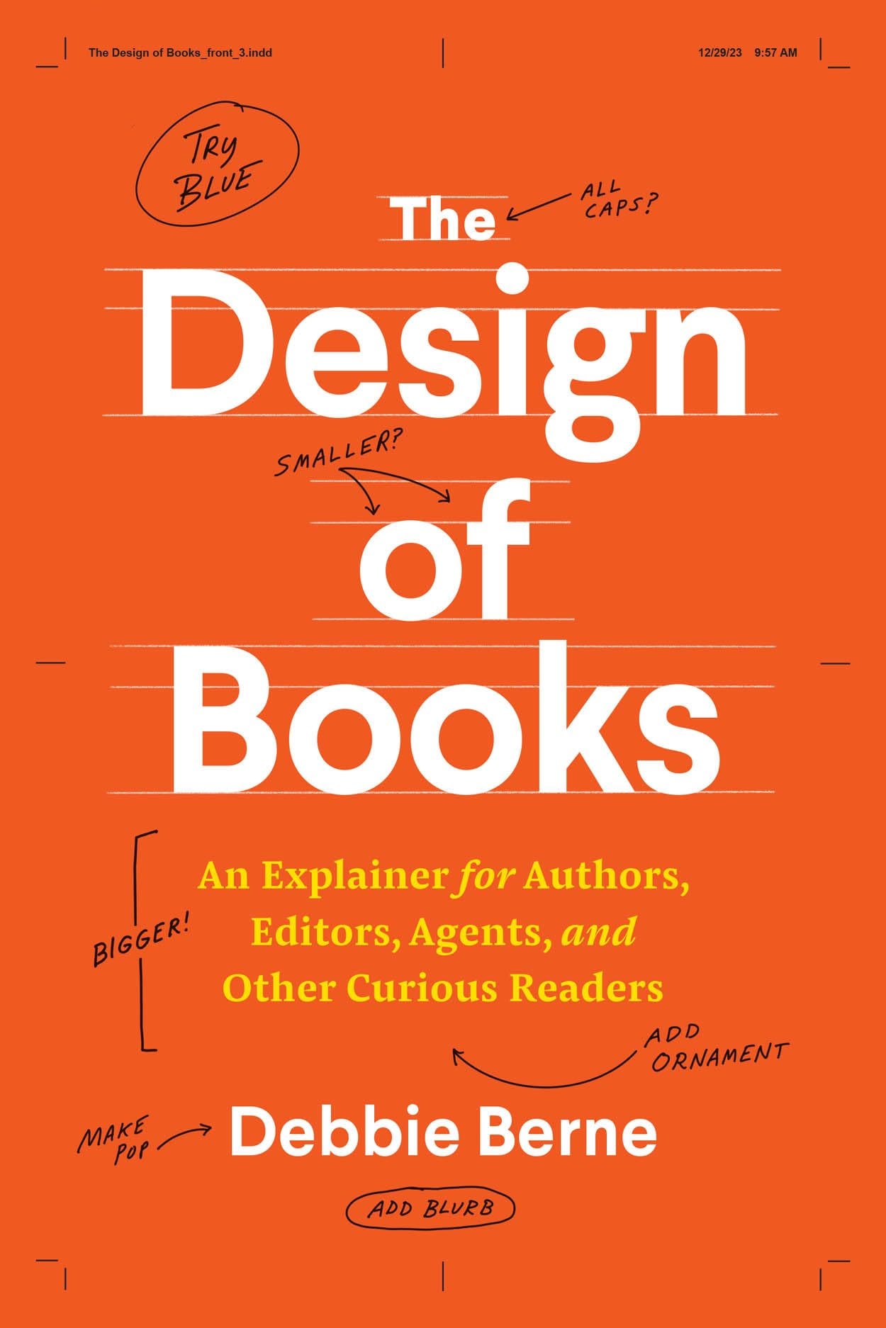
The Design of Books: An Explainer for Authors, Editors, Agents, and Other Curious Readers
Description
Seasoned designer Debbie Berne presents an accessible introduction to book design for authors, editors, and other book people.
Design is central to the appeal, messaging, and usefulness of books, but to most readers, it's mysterious or even invisible. Through interiors as well as covers, designers provide structure and information that shape the meaning and experience of books. In The Design of Books, Debbie Berne shines a light on the conventions and processes of her profession, revealing both the aesthetic and market-driven decisions designers consider to make books readable and beautiful. In clear, unstuffy language, Berne reveals how books are put together, with discussions of production considerations, typography and fonts, page layouts, use of images and color, special issues for ebooks, and the very face of each book: the cover.
The Design of Books speaks to readers and directly to books' creators—authors, editors, and other publishing professionals—helping them to become more informed partners in the design of their projects. Berne lays out the practical steps at each stage of the design process, providing insight into who does what when and offering advice for authors on how to be effective advocates for their ideas while also letting go and trusting their manuscripts with teams of professionals. She includes guidance as well for self-publishing authors, including where to find a designer, what to expect from that relationship, and how to art direct your own book.Throughout, Berne teaches how understanding the whats, hows, and whys of book design heightens our appreciation of these cherished objects and helps everyone involved in the process to create more functional, desirable, and wonderful books.
Cover
Description
Peter Mendelsund has enjoyed years as a much-sought-after book cover designer and art director. Among the many recognizable jackets he has created are those for The Girl with the Dragon Tattoo; collections of the works of Joyce, Kafka, Dostoevsky, de Beauvoir, and Foucault; the contemporary works of Martin Amis, Tom McCarthy, Ben Marcus, Jo Nesbø, and James Gleick; and many more. All have greatly benefitted from the care and touch Mendelsund gave them.
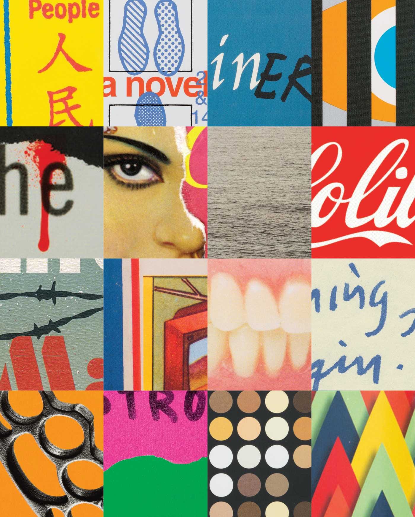
Cover abounds with Mendelsund's completed book jackets along with ephemera from his previously unseen creative method, including jacket sketches, interior art and editorial illustrations, and scores of rejected drafts. These images are punctuated by Mendelsund's reflections on his work and his process, as well as by texts from writers with whom he has worked and designed for.
Cover is a compendium of beautiful design and a beautiful design object itself; a profile and celebration of one of the publishing world's most talented and prolific contemporary creators, and a brilliant showcase of his deft touch for balanced and innovative design.
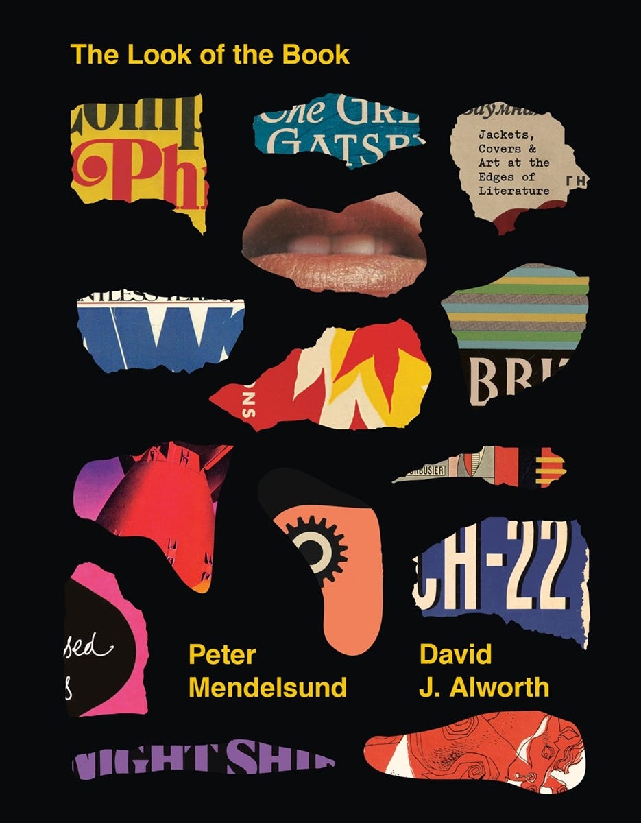
The Look of the Book: Jackets, Covers, and Art at the Edges of Literature
Description
Why do some book covers instantly grab your attention, while others never get a second glance? Fusing word and image, as well as design thinking and literary criticism, this captivating investigation goes behind the scenes of the cover design process to answer this question and more.
As the outward face of the text, the book cover makes an all-important first impression. The Look of the Book examines art at the edges of literature through notable covers and the stories behind them, galleries of the many different jackets of bestselling books, an overview of book cover trends throughout history, and insights from dozens of literary and design luminaries. Co-authored by celebrated designer and creative director Peter Mendelsund and scholar David Alworth, this fascinating collaboration, featuring hundreds of covers, challenges our notions of what a book cover can and should be.
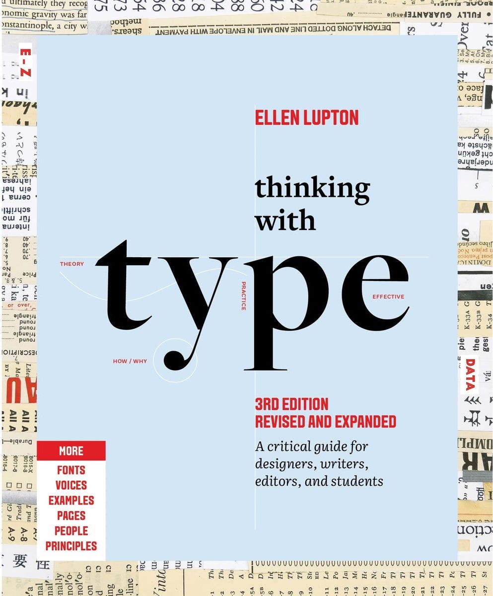
Thinking with Type
Description
The essential and bestselling guide to typography from beloved design educator Ellen Lupton—revised and expanded to include new and additional voices, examples, and principles, and a wider array of typefaces.
The bestselling Thinking with Type in a revised and expanded third edition: This is the definitive guide to using typography in visual communication. Covering the essentials of typography, this book explores everything from typefaces and type families to kerning and tracking to grids and layout principles.
Ellen Lupton provides clear and focused guidance on how letters, words, and paragraphs should be aligned, spaced, ordered, and shaped. Historical and contemporary examples of graphic design show how to learn the rules and how to break them. Critical essays, eye-opening diagrams, helpful exercises, and dozens of examples and illustrations show readers how to be inventive within systems that inform and communicate.
Featuring 32 pages of new content, the third edition is revised and refined from cover to cover:
More fonts: old fonts, new fonts, weird fonts, libre fonts, Google fonts, Adobe fonts, fonts from independent foundries, and fonts and lettering by women and BIPOC designers
Introductions to diverse writing systems, contributed by expert typographers from around the world
Demonstrations of basic design principles, such as visual balance, Gestalt grouping, and responsive layout
Current approaches to typeface design, including
Variable fonts and optical sizes
Tips for readability, legibility, and accessibility
Stunning reproductions from the Letterform Archive
Thinking with Type is the typography book for everyone: designers, writers, editors, students, anyone who works with words on page or screen, and enthusiasts of type and lettering. Readers will also love Ellen Lupton's book Extra Bold: A Feminist, Inclusive, Anti-racist, Nonbinary Field Guide for Graphic Designers.
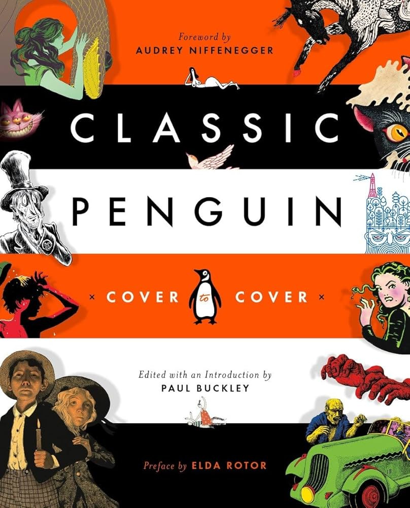
Classic Penguin: Cover to Cover
Description
From Drop Caps to Deluxes, Penguin Creative Director Paul Buckley presents a visual overview of the innovative covers that have put Penguin Classics at the forefront of the book design world
Since the launch of Penguin Classics in 1946, innovative cover design has been one of its defining aspects. Today, Penguin Classics remains at the leading edge of the book-design world. In this curated tour featuring illuminating commentary by artists and writers, including Malika Favre, Mike Mignola, James Franco, Jessica Hische, Jillian Tamaki and many more, Penguin creative director Paul Buckley showcases more than a decade of stunning cover designs and the stories behind them. For lovers of classic literature, book design, and all things Penguin, Classic Penguin has you covered.
Paul Buckley is creative director for Penguin Classics and oversees a large staff of exceptionally talented designers and art directors working on the jackets and covers of sixteen imprints within the Penguin Random House publishing group. Over the past two decades, his iconic design and singular art direction have been showcased on thousands of covers and jackets, winning him many awards and frequent invitations to speak in the United States and abroad. In 2010, he edited and introduced Penguin 75.
Matt Vee is a designer and illustrator who attended School of Visual Arts and Pratt Institute. He has received two Gold Scholastic Art Awards and created logos for worldwide brands. His work has appeared in The Washington Post, The Huffington Post, Slate, Print magazine, Paste magazine, and UnderConsideration's Brand New.
Audrey Niffenegger is a visual artist and writer. In addition to the bestselling novels The Time Traveler's Wife and Her Fearful Symmetry, she is the author of three illustrated novels and the editor of Ghostly.
Elda Rotor is vice president and publisher for Penguin Classics. She has created and edited several series, including Penguin Civic Classics, Penguin Threads, Couture Classics, Penguin Horror, and Penguin Drop Caps.
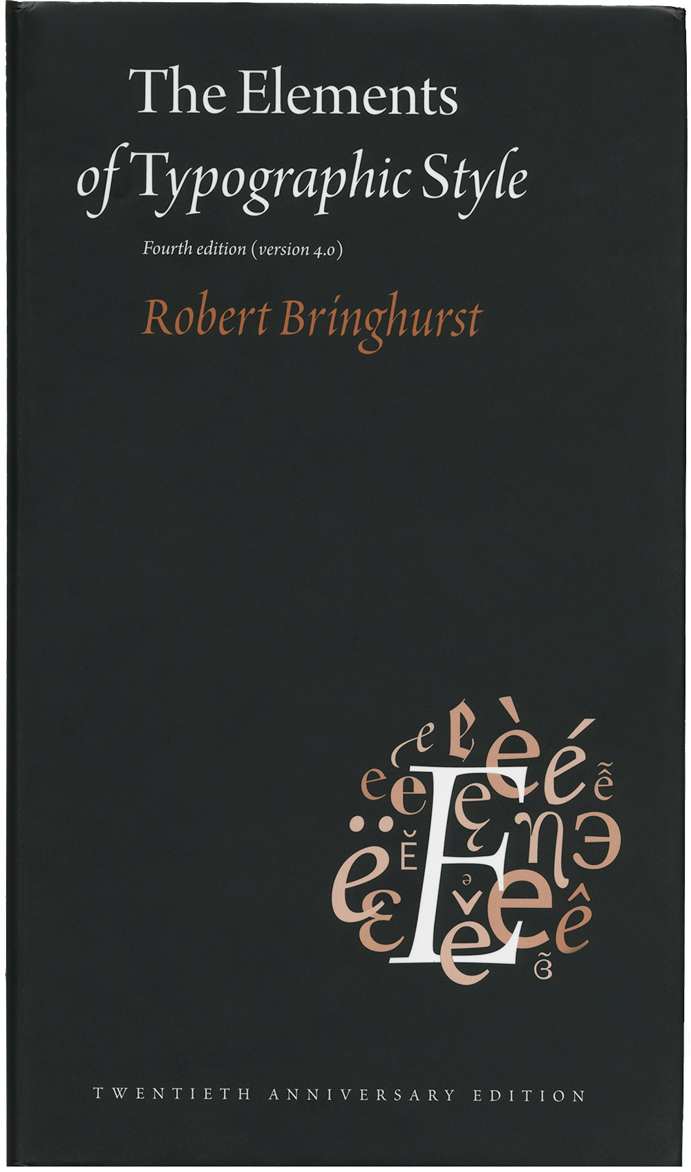
The Elements of Typographic Style
Description
Renowned typographer and poet Robert Bringhurst brings clarity to the art of typography with this masterful style guide. Combining the practical, theoretical, and historical, this edition is completely updated, with a thorough revision and updating of the longest chapter, Prowling the Specimen Books, and many other small but important updates based on things that are continually changing in the field.
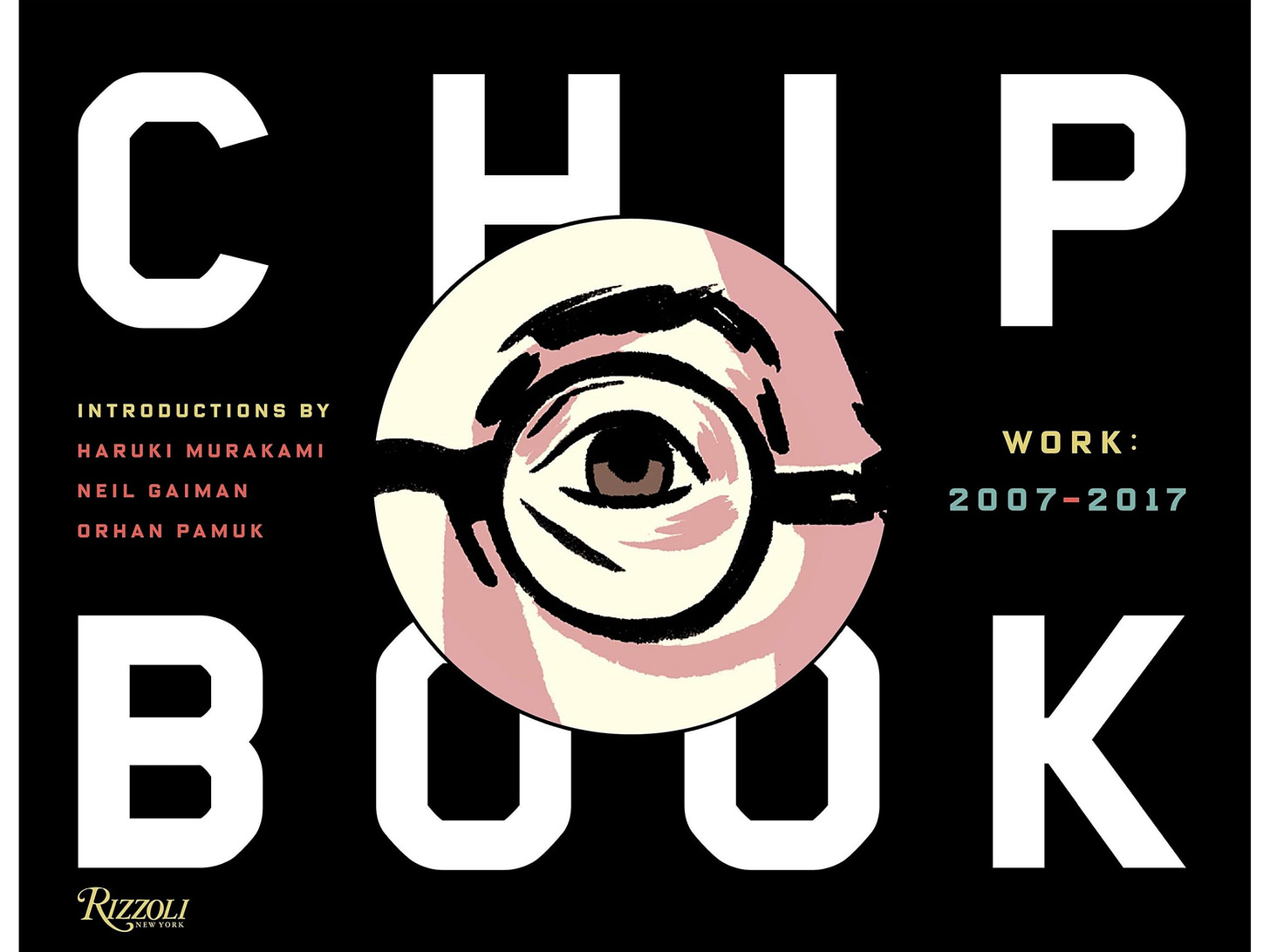
Chip Kidd: Book Two
Description
Chip Kidd is recognized worldwide as one of the best graphic designers working today, especially in book design. This is a much anticipated follow-up to Chip Kidd: Book One, where he not only showcases his most recent work, but demonstrates the relationship he has with some of the world's most influential authors and sheds light into his passion for the art of book-making and most recent expansion to other media design like film posters, magazine covers, and artist collaborations. This book is a must-have for designers and all book-lovers interested in the man responsible for some of the most recognizable book covers in the world.
CHIP KIDD, BOOK TWO is a work of art itself, a book on a designer described as "a design demigod," and "the closest thing to a rock star" in graphic design. The book will feature all of Kidd's book designs from the years 2007 to 2017, including book cover designs for best-selling authors Haruki Murakami, Cormac McCarthy, Orhan Pamuk, Augusten Burroughs, and David Sedaris, each whom share insight on Kidd's creative process and the importance his designs have had on their work.
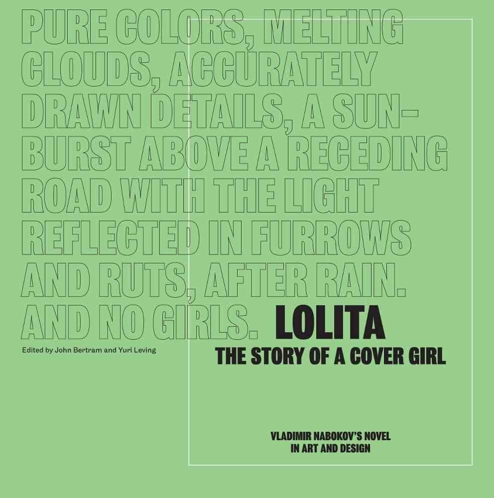
Lolita - The Story of a Cover Girl: Vladimir Nabokov's Novel in Art and Design
Description
What should Lolita look like? The question has dogged book-cover designers since 1955, when Lolita was first published in a plain green wrapper. The heroine of Vladimir Nabokov's classic novel has often been shown as a teenage seductress in heart-shaped glasses--a deceptive image that misreads the book but has seeped deep into our cultural life, from fashion to film.
Lolita - The Story of a Cover Girl: Vladimir Nabokov's Novel in Art and Design reconsiders the cover of Lolita. Eighty renowned graphic designers and illustrators (including Paula Scher, Jessica Hische, Jessica Helfand, and Peter Mendelsund) offer their own takes on the book's jacket, while graphic-design critics and Nabokov scholars survey more than half a century of Lolita covers. You'll also find thoughtful essays from such design luminaries as Mary Gaitskill, Debbie Millman, Michael Bierut, Peter Mendelsund, Jessica Helfand, Alice Twemlow, Johanna Drucker, Leland de la Durantaye, Ellen Pifer, and Stephen Blackwell.
Through the lenses of design and literature, Lolita - The Story of a Cover Girl tells the strange design history of one of the most important novels of the 20th century--and offers a new way for thinking visually about difficult books. You'll never look at Lolita the same way again.
*No affiliate link for this one—it’s not on bookshop.org. I just think this book is too good not to include.
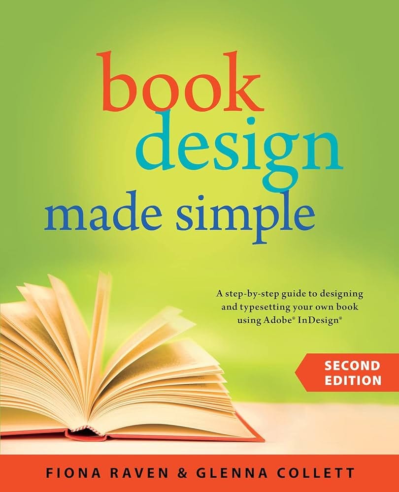
Book Design Made Simple
Description
Book Design Made Simple gives DIY authors, small presses, and graphic designers—novices and professionals alike—the power to design their own books. It's the only book of its kind, explaining every step from installing Adobe InDesign right through to sending the files to press.
Book Design Made Simple explains WHAT book design is, and HOW to do it. It guides the novice designer through the process of leasing and installing Adobe InDesign and then shows how to place the author's text into real book pages right away. From there, the look of the text is refined, one element at a time, until it develops into a coherent design that complements the text. Every imaginable kind of text is shown, and meticulous instructions are given. Examples include chapter openings, part openings, headings, lists, poetry, tables, math, extracts, table of contents, and index. Multiple choices are offered for each design element so that the reader can decide on a look and learn how to achieve it.
Stressing their conviction that a front book cover attracts but it's the back cover that sells, the authors devote an entire section to cover design--front, back, and spine—for paperbacks, dust jackets, and hard covers. With examples and illustrations, the reader is guided through decisions about typefaces, images, colors, and layout, and is given many choices as to what to include on the back cover. Setting up an Adobe InDesign document to meet printers' specifications is explained in detail. The result is a cover that will look professional in the marketplace and attract readers.
Although print books are emphasized, ebooks are also considered throughout. Some design features that work well in print might not translate in an ebook, so cautions and instructions are given in each instance.
Together with thorough design instruction, all kinds of publishing advice is offered along the way, guiding the reader through some of the tough decisions that self-publishers face concerning trim size, what printing method to use, and how and why to get an ISBN and copyright, to name a few.
In short, Book Design Made Simple is a semester of book design instruction plus a publishing class, all rolled into one. Let two experts guide you through the process with easy step-by-step instructions, resulting in a professional-looking top-quality book.
Don't Sleep: The Urgent Messages of Oliver Munday
Description
Whip-smart, and with a ripped-from-the-headlines attitude, this book is a call to arms, demonstrating the unique ability of graphic design to speak truth to power.
Part personal history, part design philosophy, and part advocacy, this volume showcases the arresting work of Oliver Munday. Employing humor and menace in equal measure, Munday wields graphic design as a tool of empowerment, activism, and resistance. Drawing from the history and utility of twentieth- century agitprop, from Russian Constructivism to the Black Panthers, Munday updates a timeless medium for the social media age with his stark and often unsettling imagery.Drawing on the madness of the 24-hour news cycle, Munday's work has been featured on the op-ed pages of the New York Times, the New Yorker, Time Magazine, and the Atlantic. Munday exploits a digital platform to poke fun at the 2016 presidential election, renounces warfare in the age of drones, and examines the tragic legacies of Trayvon Martin and Eric Garner, offering a perspective that must not be overlooked. His design, reflecting influences from Paul Rand to Globe Poster, champions a think more, design less philosophy with the ultimate goal to provoke contem-plation and even meaningful action.
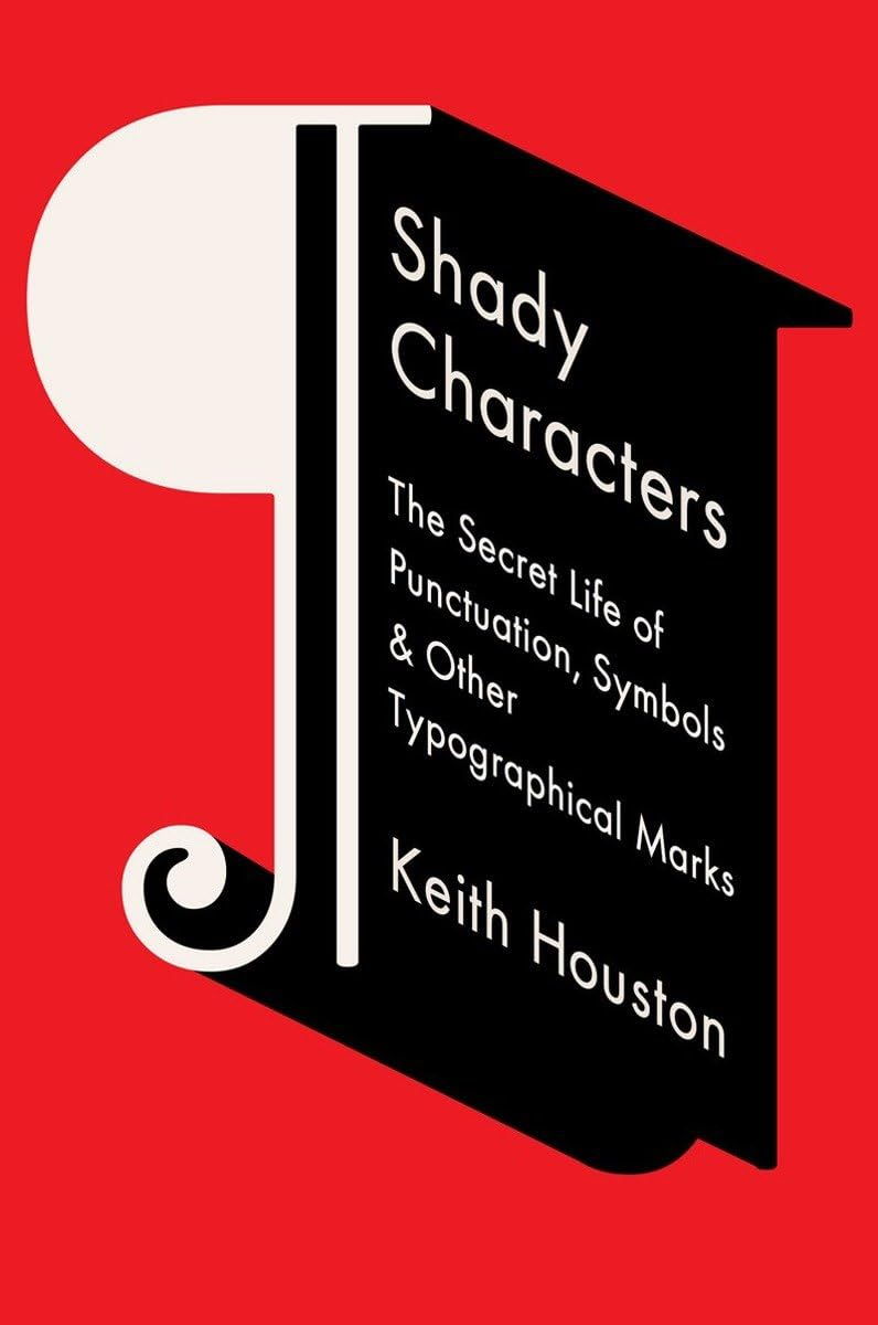
Shady Characters: The Secret Life of Punctuation, Symbols, and Other Typographical Marks
Description
A charming and indispensable tour of two thousand years of the written word, Shady Characters weaves a fascinating trail across the parallel histories of language and typography.
Whether investigating the asterisk (*) and dagger (+)—which alternately illuminated and skewered heretical verses of the early Bible—or the at sign (@), which languished in obscurity for centuries until rescued by the Internet, Keith Houston draws on myriad sources to chart the life and times of these enigmatic squiggles, both exotic (¶) and everyday (&).
From the Library of Alexandria to the halls of Bell Labs, figures as diverse as Charlemagne, Vladimir Nabokov, and George W. Bush cross paths with marks as obscure as the interrobang (?) and as divisive as the dash (—). Ancient Roman graffiti, Venetian trading shorthand, Cold War double agents, and Madison Avenue round out an ever more diverse set of episodes, characters, and artifacts.
Richly illustrated, ranging across time, typographies, and countries, Shady Characters will delight and entertain all who cherish the unpredictable and surprising in the writing life.
Layout Essentials Revised and Updated: 100 Design Principles for Using Grids
Description
A classic and essential text for designers since 2009, Layout Essentials: 100 Design Principles for Using Grids just got better with a fresh exploration of its design principles, updated text, and new photos and international graphics.
Grids are the basis for all design projects, and learning how to work with them is fundamental for all graphic designers. From working with multi-column formats to using type, color, images, and more, Layout Essentials not only demonstrates, using real world examples, how to use grids effectively, but shows you how to break the rules to use them effectively, too.
This revised and updated version of Layout Essentials is your one-stop reference and resource for all layout design projects.
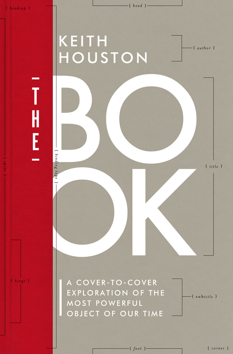
The Book: A Cover-To-Cover Exploration of the Most Powerful Object of Our Time
Description
We may love books, but do we know what lies behind them? In The Book, Keith Houston reveals that the paper, ink, thread, glue, and board from which a book is made tell as rich a story as the words on its pages—of civilizations, empires, human ingenuity, and madness. In an invitingly tactile history of this 2,000-year-old medium, Houston follows the development of writing, printing, the art of illustrations, and binding to show how we have moved from cuneiform tablets and papyrus scrolls to the hardcovers and paperbacks of today. Sure to delight book lovers of all stripes with its lush, full-color illustrations, The Book gives us the momentous and surprising history behind humanity's most important—and universal—information technology.
The Clothing of Books*
Description
A deeply personal reflection from the Pulitzer Prize-winning author of The Namesake that explores the art of the book jacket from the perspectives of both reader and writer.
How do you clothe a book? Probing the complex relationships between text and image, author and designer, and art and commerce, Lahiri delves into the role of the uniform; explains what book jackets and design have come to mean to her; and how, sometimes, “the covers become a part of me.”
*This book fueled one of my earlier newsletters: Book Covers (Don’t) Matter. It’s really good—you should check it out.
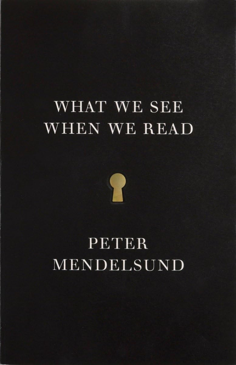
What We See When We Read
Description
A gorgeously unique, fully illustrated exploration into the phenomenology of reading—how we visualize images from reading works of literature, from one of our very best book jacket designers, himself a passionate reader.
What do we see when we read? Did Tolstoy really describe Anna Karenina? Did Melville ever really tell us what, exactly, Ishmael looked like? The collection of fragmented images on a page—a graceful ear there, a stray curl, a hat positioned just so—and other clues and signifiers helps us to create an image of a character. But in fact our sense that we know a character intimately has little to do with our ability to concretely picture our beloved—or reviled—literary figures. In this remarkable work of nonfiction, Knopf's Associate Art Director Peter Mendelsund combines his profession, as an award-winning designer; his first career, as a classically trained pianist; and his first love, literature—he considers himself first and foremost as a reader—into what is sure to be one of the most provocative and unusual investigations into how we understand the act of reading.
Thanks for reading! I hope you found a book here that sounds interesting. If you don’t want to buy a book, but you do want to support this newsletter, you can do so by “buying me a coffee” or becoming a paid subscriber.
Paid subscribers get access to my bonus newsletter series How to Design a Book Cover. You can read the first post in the series for free here:
Colophon
A Book Designer’s Notebook is a newsletter about book design and creative practice from the desk of Nathaniel Roy.
It uses the typefaces Merriweather, Futura, and whatever fonts Substack has chosen. Merriweather is a Google font designed to be a text face that is pleasant to read on screens. Futura is geometric sans-serif designed by Paul Renner in 1927. It is on the moon.
Nathaniel Roy is a book designer, collage maker, photo taker, self publisher, and a few other things in Ypsilanti, Michigan.
You can see his work and hire him here.






![The Clothing of Books [Book] The Clothing of Books [Book]](https://substackcdn.com/image/fetch/w_1456,c_limit,f_auto,q_auto:good,fl_progressive:steep/https%3A%2F%2Fsubstack-post-media.s3.amazonaws.com%2Fpublic%2Fimages%2F14a3b7fc-007c-4931-9829-fcce5a5a0019_852x1200.jpeg)


Found my way here via your post on the pilcrow. I learned to love design as a very new editor sitting next to a designer doing manual paste ups, scalpel in hand. Do you know this lovely book about fonts? https://www.simongarfield.com/books/just-my-type/
I’ve been in the book business since my 20s, have worked on 48 books in one capacity or another. Worked with many book designers.
I wish I could buy every one of the books you note. It’s a pleasure even to read the titles and descriptions. Thank you!