A Big Red Book About the Movies and the People Who Love Them
Designing Cinema Ann Arbor by Frank Uhle
At the risk of squeezing a dry sponge, I want to tell you about a book I designed.1
I got lucky. This project was a case of right place, right time, and an author who just couldn’t stop writing.
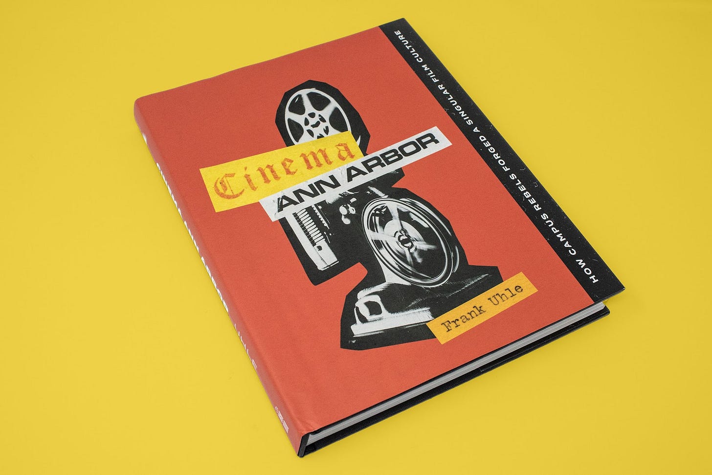
Frank Uhle came to the Ann Arbor District Library with the seedling of a book. A very tall seedling. For the University of Michigan’s Bicentennial three years prior, Uhle, a cultural historian and university employee, set out to write an article about the school’s student film societies. Discovering a deeper, more dramatic history than he could have imagined, he didn’t finish the article in time. His little seedling grew, and grew, and grew. After three more years and many additions, Cinema Ann Arbor: How Campus Rebels Forged a Singular Film Culture was published in 2023 in a collaboration between Fifth Avenue Press and University of Michigan Press. I designed the cover; Amanda Szot, Amy Arendts, and I designed and typeset the interior.
When it was time to design the book, Uhle gave our team a book to reference called Mind Over Matter: Myths & Mysteries of Detroit’s Fortune Records. The book wasn’t bad looking, but its design was a bit paint-by-numbers. We thought we could do better. The three of us took home a bit of text and returned to the office with a few sample book spreads. Swiping a typeface here and a column structure there, I frankensteined a new draft to present to the author alongside a style document outlining the visual plans for the book.
The Type
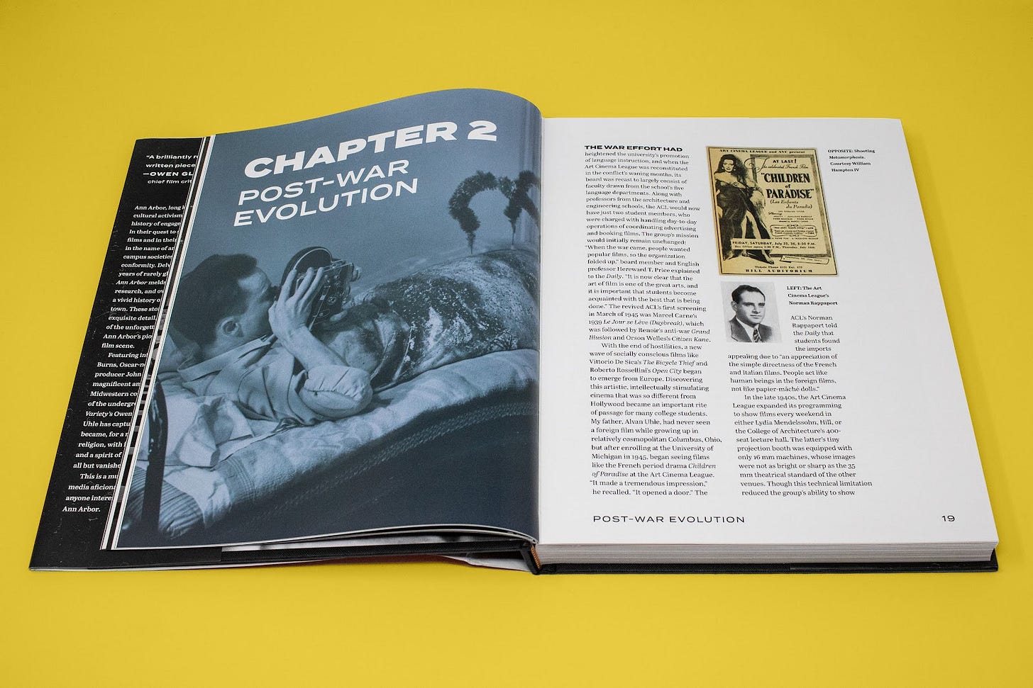
To contrast the vintage ephemera and photographs, I chose the bold and contemporary typeface Termina for headings. We used Abril for the body text. It paired well with Termina, looked good in our column structure, and was a versatile typeface with lots of styles in its family.
The Colors
We chose red, green, and blue for our palette to reference the RGB color model used in traditional photography and filmmaking, though we played with the hues to better complement the tones of the book’s paper ephemera images. I added yellow, black, and a light gray to round out the palette.
The Grid
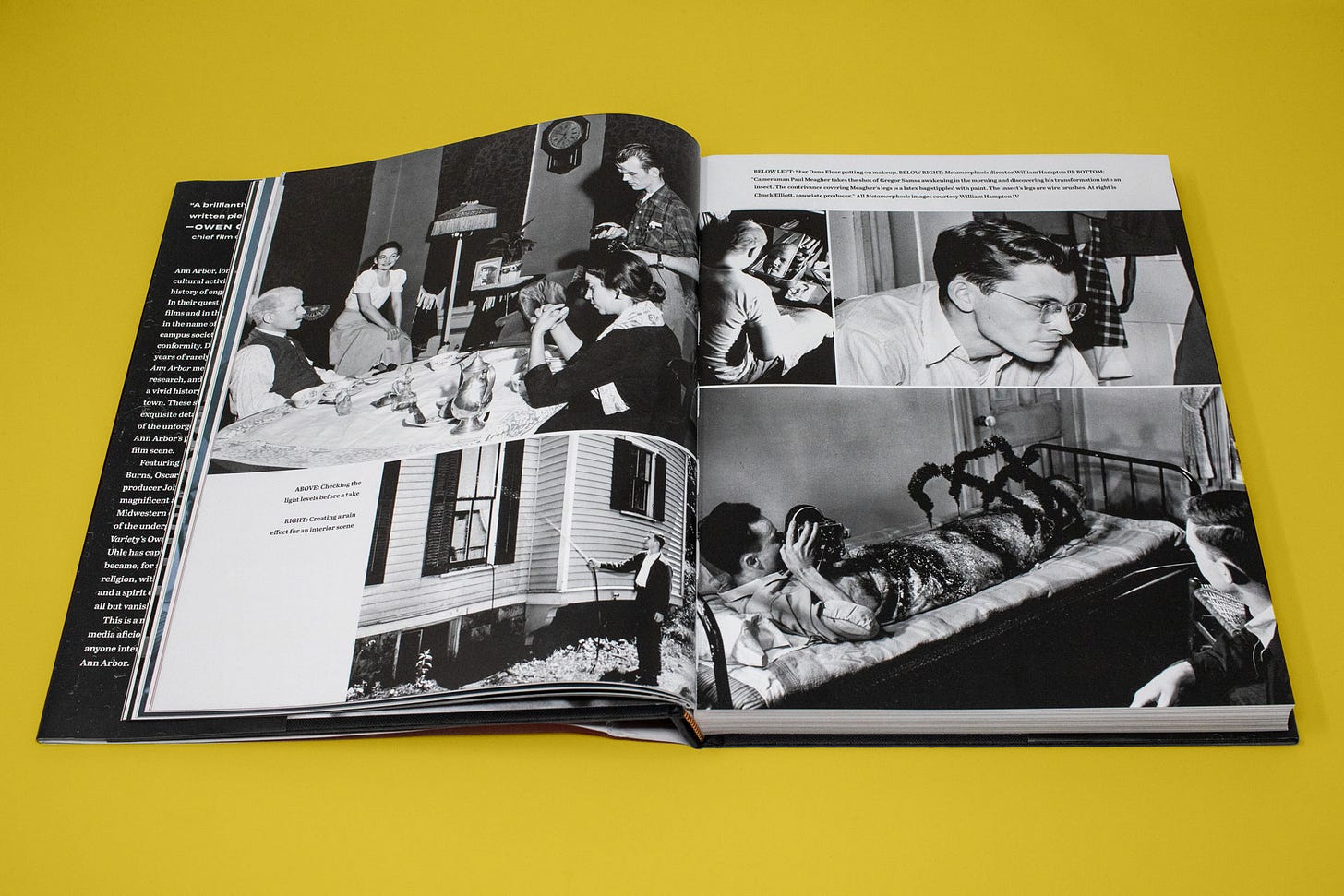
Possibly the most important piece to the design of this book was its grid. Ironically, we also ignored it in several instances. Know the rules to break the rules. Cinema’s pages were designed on a flexible five-column grid that allowed for one or two columns of text and a generous margin in which to tuck captions. With the need to accommodate several high-resolution illustrations, flexibility and variety were the primary goal for this layout.
The Images
With respect to Uhle’s writing, the true treasure of this book is its images—some of which were published for the first time in these pages. The posters, advertisements, news clippings, calendars, membership cards, and photographs were a film lover’s dream and a graphic designer’s playground. And play we did! Whenever we could, we placed images full bleed.2 On several occasions throughout the book, ephemera leans in from the edge at what we called “jaunty” angles. This is a history book, but we wanted it to feel alive. Alive, if you’ll allow me a corny moment, like the movies.
The Cover
Uhle came to us with a particular image in mind for the cover: a never–before–published photo of the Velvet Underground performing on U-M’s campus. I tried a few options with and without it.
The image was interesting, but vague. What is going on here? How does this relate to cinema? I took a different tack for round two: collage.
I’m always trying to squeeze collage onto my book covers, but for this book it made a particular kind of sense. There is a century of film society history represented, and it’s also about rebellious students. It’s also illustrated by a collage artist’s wet-dream3 worth of vintage paper ephemera.
Here’s what I came up with:
This cover excited me and felt like the right direction. As I tinkered and reviewed, I realized—consciously or unconsciously, I can’t remember now—I had placed ephemera that made up the book’s name. I also had scans of Uhle’s own student film group membership cards from his time at U-M. How often can you present a book cover’s main information with the provided illustration material? We eventually swapped the handwritten author name for a more legible, typed version, but I landed on what essentially became the final cover:
The Collaboration
This may only be of interest to publishing nerds like me, but one of the most interesting—and scary—parts of working on this book was the collaboration that ensued near the end of the process.
Fifth Avenue Press at the Ann Arbor District Library is not a normal publisher. The most concise way to describe it is a local, non-profit, hybrid publisher. As part of our agreements, authors may take the book we produce together and publish it elsewhere, no questions asked, aside from keeping the book in the collection. We have no financial stake in the book’s sales. About three quarters through the production process of Cinema Ann Arbor, Uhle secured a publishing deal with the University of Michigan Press to co-publish and produce the physical book. This was essential for a book like Cinema, because Fifth Avenue Press does not pay to have books printed. And a 300+ page, full-color coffee-table book is not cheap to produce.
This collaboration was fruitful, though at one point it flirted with disaster (from my perspective) in the form of a potential black and white interior to save on printing costs. I am admittedly prone to sentimentality, but this would have been heartbreaking. However, based on the strength of the work done so far—presented to the press editorial director in a wire-bound proof made at Kinko’s—the book stayed in color. It couldn’t enter the world in any other way.
Sending my design files to another publisher felt a little like sending a child to live with a distant relative.4 Will they come home with a weird haircut, or worse, a grievous injury? Thankfully, this was not the case. The unique path this project took allowed for a creative freedom and production value that may not have happened otherwise. I’m grateful to the team at U-M Press for thoughtfully shepherding the production of this book.
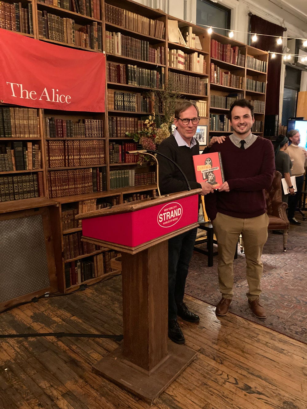
Samples of the book arrived just in time for Uhle to take to the 2023 Ann Arbor Film Festival—an integral part of his book’s story. Cinema Ann Arbor was widely available a few months later. The book was shortlisted for the 2023 Alice Award and named a 2024 Michigan Notable Book. Earlier this year, I submitted it to the American Institute of Graphic Arts 50 Books | 50 Covers competition.5
(I don’t get anything from a purchase—I just want you to read the book!)
I am trying, and I think failing, to talk about this without pretension or self-importance. It might not be possible; I cannot overstate how important this book is to me. Both because of the work, which is probably, terrifyingly, my best to date, but also because of the way in which it was produced—with tremendous collaboration and on behalf of the public library, an institution I adore. One year later, and the impact of this book still reverberates.
Thanks for taking the time to read about the design process for Cinema Ann Arbor. I hope that each of you, even if it’s just once, get to work on something so fulfilling.
Until next time,
—Nathaniel
I was trying to avoid that gruesome, equestrian-based idiom I could have used here. Did that work for you? Call your local representative and let them know.
Anyway, I’ve posted about this project at length on Instagram, and I mentioned it briefly in one of my early newsletters that hardly anyone read, but it occurs to me that here lies a fresh audience for promotion of one of my proudest projects. Though I do have an internal voice saying this might be vainglorious, or that nobody cares. If that’s you, fair. Just leave a like on your way out, would you?
A printing term for when an image extends to the very edge of a page. In the file, the designer extends the image beyond the document’s trim line.
Sorry.
I know, I know, I AM DRAMATIC
I haven’t heard anything yet, but should hopefully soon.







I love the behind-the-scenes account; so cool! Congrats—you should absolutely be proud and shout it from the rooftops. P.S. I also still refer to it as Kinko’s 😂
I love hearing more about design decisions, what worked and what didn't. And why! Good stuff.